Archives for the month of: February, 2013

DOUBLE PAGE SPREAD ANALYSIS

Colour Scheme and Overall Look

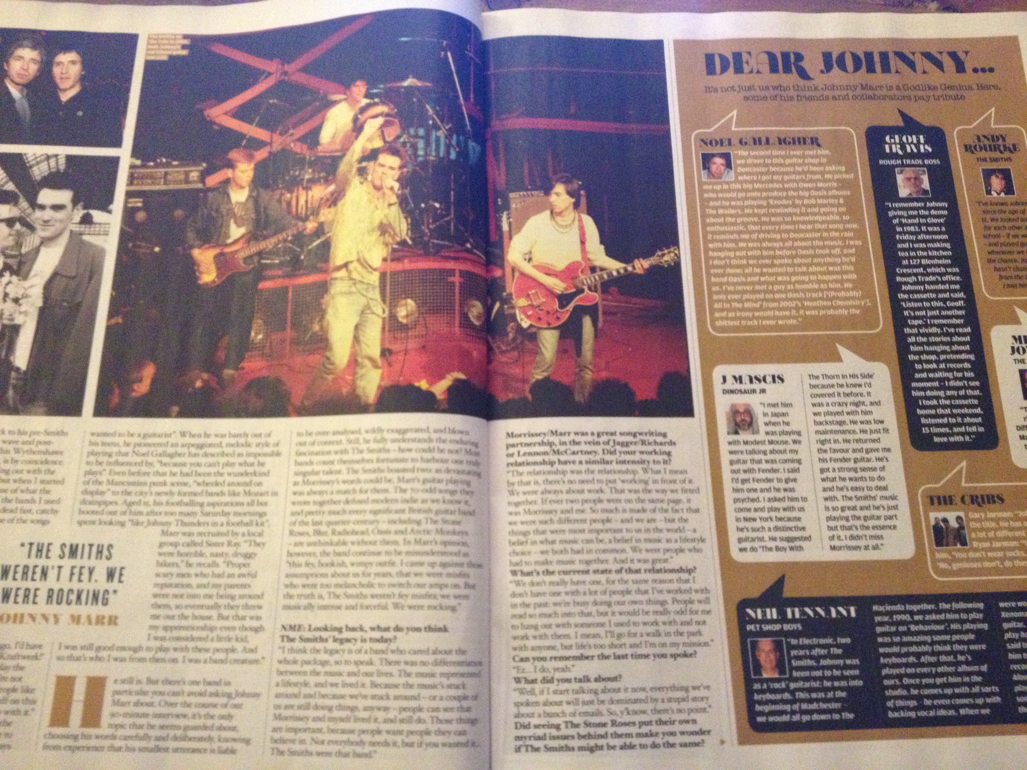
The choice of colours on this double page spread differ slightly from the colour scheme of the contents page and front cover of the issue; whereas the other pages used mainly black and red, no red is present on this page and instead the colour scheme consists of black, white and gold. This slight alteration in the colour way keeps the magazine interesting, and the addition of the gold colour complements the black-on-white text well and gives the page an almost vintage-like feel, which is appropriate due to the content of the article being on an old 80s band, ‘The Smiths’. The gold colour on the page is used as a background to a section titled “Dear Johnny”, which is full of other friends and collaborators, all from other old 80s bands, paying tribute to Johnny Marr, which therefore makes the vintage-like gold colour highly appropriate for this part of the feature. Most of the people reading this article, due to the band featured, will be at the older end of the target audience age category, which is another reason why such a colour scheme has been chosen for the spread.

Photography

All of the photography used on this particular double-page spread is from a selection of previously taken, older images. No brand new photography taken especially for the newly written feature appears to be present on the page. The nature of the photos varies from live photos, posed photoshoot pictures, and also candid photos from events. Rather than focusing on Johnny Marr himself, the photos tend to focus on his band, The Smiths, as a whole, due to the fact that this band was primarily what made Johnny Marr so famous. The reason behind the inclusion of older photos rather than a brand new photoshoot is most likely purely because real fans of The Smiths would rather look at past images of the band, in their prime and in their time, than newly posed photos as they do not have the same effect. This choice to use older photography is very well suited to the target audience of this particular article in the magazine as it caters for their particular wants and needs.

Writing Style

The writing style of the article on this double-page spread takes a  much more formally written, serious and informative approach in comparison to some of the text on the front cover and contents pages. Elaborating on this, the level of vocabulary used is of a much higher standard, with the inclusion of certain words, phrases and sentence structures that the younger end of the target audience age category would perhaps not feel particularly comfortable with understanding or even reading, for example; “The quintissential axeman of his generation”, “He pioneered a arpeggiated, melodic style of playing” and “He had been the wunderkind of the Mancunian punk scene” and so on. However this higher-end writing style is, much like the rest of the page, very well suited to the target audience of this particular article who are most likely to be long-term fans of The Smiths and Johnny Marr himself and will be most interested in reading a very well-written article about him as a musician and about his career. They may feel that the more well-written the article is, the more respect that the magazine has towards the artist, which will be important to the target audience.

Text/Picture Ratio

In this instance, the text/picture ratio is highly different to that of the contents page. Whereas the contents page was designed to suit a wider target audience who would prefer a higher ratio of pictures to text, this particular double page spread on Johnny Marr is designed to suit a specific and more narrowed sample of readers who would be more likely to appreciate a higher ratio of text on the page as they would rather have an actual article to sit and read rather than simply a page covered with photos that they can simply glance at. It is also worth noting that, as previously mentioned, the pictures on the page are a selection of older photography rather than a brand new photoshoot, so this may also be part of the reason that less pictures were used in comparison to the amount of text, as the editors will have had a more limited choice when picking out photos to use on the page.

Fonts

Similar to the change in colour scheme, there has been a slight change in font from the contents page to the double page spread. Whereas the contents page used a more basic, neutral and approachable font, the double page spread’s main body of text is written with a more formal font, similar to that of a newspaper. This will again be due to the age and more serious interests of the article’s specific target audience, and the more formal text complements the vintage-like colour scheme and overall look of the spread very well.

photo (69)

econtact sheet

After taking the photos for my music magazine, it was appropriate to select the few that I was going to use for my final product. After analysing other current music publications, I learned more about the certain styles and set-ups of photos that suit particular genres of magazines and certain target audiences. I used this knowledge and research to help me to select the most appropriate photos from the set that would best reflect the specific genre and target audience for my magazine. Most music magazines of genres similar to that of ‘Pit’ contain a mixture of posed, professional looking photos, and more natural and candid photos, accurately reflecting the fun nature and attitude behind the bands that play the music of that genre. More natural photos that appear to have been taken almost accidentally are more easy for younger readers in my target audience to relate to as it makes them feel as if the bands are far more approachable and similar to them as people; this highly influenced the choice I made as I chose two photos that showed the boys in a more professional and traditional photoshoot pose, and another which was taken by accident but since the nature of the photo was rather humorous, I felt that the use of this photo would be rather effective and appealing to my younger target audience and upon editing the photo I already had a rough idea of the way in which I was going to incorporate it into my double-page spread. My final product requires 4 images that I have taken myself. Due to the fact that I felt that only three images from this set were suitable and could be improved with editing, I had to take a second set of photos later on, for which I created a second contact sheet for selection.

contact sheet 2

CONTENTS PAGE ANALYSIS

Colour Scheme

Remaining consistent with the rest of the magazine, the colour scheme keeps to a basic minimum of three colours; black, white and red. This, as previously stated, is to keep things as simple as possible, as the main focal point of the contents page is the photography of the bands and artists featured, so the colour scheme for the page surrounding them has been designed to make these photographs stand out even further. Having the colour scheme as miminal as possible also ensures the page doesn’t look too overcrowded or busy and allows for easy reading and understanding for the younger target audience. Red, the brightest colour in the colour scheme, has been used for emphasis on the most important parts of the small amount of text on the page, such as the page numbers and the small subscription offer/advertisement in the bottom right corner of the page. This choice will have been for the purpose of emphasising the parts of the page that the readers will be most interested in, and also the parts of the page which the editors want the readers to be drawn to the most, hence why they chose to use red for the subscription advertisement, to encourage readers to spend money and, in turn, agree to continuously buy the magazine.

Photography, Text/Picture Ratio and Overall Look

The style of photography on the contents page covers variety of different types and settings; some of the photos are live photography, some are behind-the-scenes candid photos of the bands, and some are extracts from photoshoots of the artists. The reason behind the variety in photography styles is likely to be for the purpose of keeping the contents page interesting and to reflect a variety of content within the magazine; the magazine does not only contain live reviews or articles on live shows, nor does it only contain interviews accompanied by photoshoots, so the variety in types of photographs used on the contents page is representative of the diverse range of features within each issue of NME. This ensures that the contents page gives off the impression to readers that the magazine is full of different kinds of articles relating to different genres of bands and that the features printed range across a broad spectrum. The contents page has been made this way to give potential readers further reason to choose to read NME over other music magazines due to its clear wider variety of content which effectively makes the product more interesting and appealing. Different types of photos are also used depending on the nature of each individual article that they represent. As the target audience for most music magazines lies within the age category of 16-25, and according to my own survey results answered by a similar target audience, it appears to be the case that most of this age category prefer a higher picture to text ratio in a magazine, and this is the ratio that the editors of NME have followed for the contents page, with minimal text and pictures that take up almost the entire page. The youthful target audience of teenagers and young adults prefer to see more pictures than text as they tend to much prefer an aesthetically pleasing and easy-to-read magazine rather than a complex and overly-informative one.

Writing Style

The majority of the text on this contents page is made up of direct quotes from the bands or artists themselves, accompanied by short anchorage lines underneath as a brief description or introduction of the article that that page number is referring to. The writing style of the text is mainly “chatty” and informal, with phrases like “Well it’s no secret anymore, Ryan Jarman” in a sort of reply to the quote that was used from that artist beforehand. The use of this writing style makes the magazine more approachable and relatable for the target audience, rather than something formal and serious. Younger target audiences like the readers of NME tend to prefer a magazine that has a slight touch of humour to its editorial style as this makes the magazine more fun and enjoyable to read and may encourage people to purchase the magazine again in future. A good editorial style is one that makes the target audience feel as comfortable as possible when reading the magazine, and NME have chosen the correct writing style in order to achieve this for their target audience.

Fonts

The fonts used on the contents page vary slightly from the fonts used on the front cover of the magazine. Whereas the fonts on the front cover were more basic, the fonts used on the contents page are slightly more fancy and the fonts used are not consistent across the page, varying in size, capitalisation, boldness and actual font style in different parts of the page. In some cases this variation of fonts could make a contents page or any page in a magazine look slightly messy, however NME have managed to avoid this by keeping the colour scheme basic and ensuring that all text remains black on white, meaning that the variation in fonts simply makes the page seem more interesting and again, reflects the diversity of genres of the magazine by using a diverse range of font styles. Despite the different fonts used, the contents page remains easy to read and not overly complicated to glance at, which makes the page suitable for the target audience who are not likely to pay much attention to the contents page and are simply interested in something simple that will enable them to easily navigate to their desired section of the magazine.

photo (67)

FRONT COVER ANALYSIS

Colour Scheme 

The colour scheme of the front cover of this issue of NME magazine is a bold and basic combination of white, black and red. The main title of the magazine, a few of the secondary coverlines and the puff located in the top right corner of the front cover are coloured red, the background is an off-white colour and the rest of the text on the page is black. Since the magazine covers music of a broad mix of genres of music, including anything from indie to pop and rock, I think the choice of this particular colour scheme was appropriate as these are rather neutral and basic colours, a combination of monochrome with the addition of one bright primary colour that are likely to appeal to all potential readers, as NME magazine appeals to a very diverse and broad target audience with a wide range of musical tastes and preferences. The colour scheme does not give potential readers much indication that the magazine covers one particular genre, and this is correct, so this is the best approach and choice that the magazine could have taken in order to let readers know that they are picking up a magazine that covers all features all genres of music.

Photography and Overall Look

The front cover of all NME magazines tends to feature a cover photo shot in a studio setting. Sometimes the photos are close-up, however sometimes the photos are zoomed out far enough to show the entire cover star’s body, showing their feet on the ground, indicating that this photo is the raw studio picture with a real white studio background as opposed to one that the person has been superimposed onto.The photo is bright and well-lit to fit with the bright white background, and I think that the addition of front cover star Johnny Marr’s red guitar was chosen specifically so that this would fit with the red part of the magazine’s colour scheme and match with the red title and puff on the same page. Similarly, Marr is dressed in an all-black outfit, again maintaining the consistent colour scheme across the colour scheme, matching the black text on the page and also keeping the overall look of the front cover basic and simplistic, which reinforces the message of a broad and diverse range of content inside the magazine, with no part of the front cover giving off any indication of any specific featured genre. Placing an all white background behind the cover star and keeping the text on the page monochrome and consistent in size also places further emphasis on the cover star himself, making him the focal point of the front cover.

Writing Style

Though writing is kept to a minimum on the front over, many secondary coverlines are present. Most of the text on the front cover is made up of quotes, from either the cover star speaking within their feature or from the feature article itself to give the readers an insight into what lies inside the magazine. Little indication of the age of the magazine’s target audience is given through the text on the front cover, other than a minor use of slang or “chatty” and informal vocabulary in some places, such as “Test your knowledge, braniacs” which shows that the editorial style of the magazine is less than formal, maintains a light-hearted, approachable and easily readable feel and is capable of appealing to and being appropriate for a very wide and diverse target audience. The magazine’s readers range from people in their mid-twenties who are serious about their music, to mid-teens who want to read something a little less serious and are partial to the occasional use of slang or chatty language, therefore the editors of the magazine have to find an appropriate balance when choosing the editorial style for their product.

Text/Picture Ratio and Font/Text Style

There is a much higher ratio of text to pictures on the front cover of this issue of NME. As previously stated, the cover photo of this particular issue only features one musician by himself, with the white background behind him flooded with text from the main and secondary coverlines of the magazine. In some places, certain words within one sentence or quote have been made larger and bolder in comparison to the rest of the sentence/quote in order to place emphasis upon a certain phrase, and this technique has been repeated several times, along with an alternating font down one side of the page for different quotes but for the same feature. This shows that much more attention has been paid to the look of the text on the front cover than the photography style on the page. This variation of font, size, boldness and colour throughout the cover’s text keeps the cover looking interesting and allowing the editors to subtly spice up the simplistic, minimalistic and basic overall look of this page without making it look too “busy”. Again, the reasoning behind the way some text has been emphasised is due to the target audience; if the editors feel that a fairly large amount of text must be featured on the front cover, emphasis on key words is important as this makes it easier to read for the audience rather than one long block of text in the same font, colour and size. Younger audiences tend to be lazier with regards to reading large blocks of text, so a magazine front cover that contains one main stand-out photo and a few key words that will catch their eye is most appropriate.

Publisher

NME magazine is published by IPC Media which is a subsidiary of Time Inc. They have a large portfolio and their yearly circulation of magazines is approximately 350 million. With such a wide and diverse portfolio, they do not target a specific demographic, and instead cover many genre areas within their magazine products. Some examples of other magazines they publish include Horse & Hound, Marie Claire, Look, Now, Ideal Home, Golf Monthly, Cycling Weekly, Rugby World, World Soccer, TV Times, Chat, Pick Me Up, Woman’s Weekly, Good To Know Recipes, Nuts and Mousebreaker. These magazines are all clearly from entirely different genres and this shows that IPC Publishing target a wide range of audiences from all different ages and lifestyles with their products. NME and Uncut magazine are the only two entirely music-related products that this company publishes.

photo (60)

photo (56)

When trying to come up with potential titles for my music magazine, I had a lack of creativity and as I am very picky I found it a struggle to settle for ideas that I thought were remotely appropriate or good enough at all. After mind-mapping a few basic ideas, I narrowed down my favourite two choices to “Pit” and “Edge”. I liked both of these ideas as they are short, catchy, individual, relevant and easy to remember. The reason for their relevance is because the nature of each of the words is very appropriate to the genres of music that my magazine is going to cover, which are hardcore and pop-punk. “Pit” would be in reference to the mosh pits that are created at hardcore and pop-punk shows and also what separates and distinguishes these types of shows from others, whereas “Edge” would be in reference to the “straight-edge” lifestyle that a large group of fans of these two genres of music choose to adopt. However, after doing some of my own research, I discovered that “Edge” magazine already exists, and therefore I cannot use this name for my magazine for copyright and legal reasons. For this reason, and also due to the popular demand of the title after analysing my survey results, I decided upon “Pit” as the final choice of the name of my music magazine product.

photo (61)

Above is a very rough draft of an idea I have for the front cover of my music magazine. The most important part of this design for me is the title of the magazine; this is going to be the most noticeable part of the front cover as I want it and the meaning behind the name of the magazine to make a real impact. I chose to use a varsity-style font for the title, secondary coverline titles and the main coverline of my front cover. The reason for this is because, as previously mentioned, the ‘varsity’ style and ‘varsity’ font are very commonly used and associated with the hardcore and pop-punk genres that my magazine covers. Any potential readers who see the main font used on my front cover will immediately become aware of the genre of its contents, which is why the use of this font is so significant, crucial and important to the appeal of my magazine.  fact that the magazine has maintained the traditional style will also be another reason why my target audience will be more drawn to reading ‘Pit’ magazine. This kind of font looks great when teamed with bold colours and images of hardcore shows, with its bold, capitalised and well-structured letters reflecting the sheer velocity, power and attitude of the music and the culture surrounding it. I am going to combine this font with varsity style colours that suit the font, such as oranges or greens, however the colour scheme of my magazine will be easier to decide on once I have begun constructing the front cover on InDesign which will allow me to play around with the combination of different fonts and colours and layouts to find the most suitable looking design. The main central image on my front cover is going to be a studio photo with a white background that will remain part of the image and will serve as a background to the front cover; the text of the secondary coverlines and their accompanying anchorage text will simply lay over my main image, in black, bold, stand-out font, with no extra background or block colours behind them. I feel that the overall design of my front cover, once the text, colour scheme and the final image for it have come together, will create a big impact and will help fill a real gap in the market for a magazine of this calibre, genre and overall look and feel.

colour schemes

Choosing the colour scheme of my magazine is very important as the colours are crucial for attracting and appealing to my specific target audience. The colours used on the front cover of the magazine and throughout its pages have to be both attractive, appropriate and relevant to the interests of the target audience and have to be bold enough to encourage them to pick up and read the magazine when they see it. Although I feel that the main motivation behind the colour scheme of a front cover of a magazine should be those that match the colours of the main front page photograph, the colours also have to be relevant to the music genre that the magazine covers. My music magazine covers the genres of rock/metal/hardcore/pop-punk. For this reason the colours chosen have to be bold, bright and representative of power and attitude and rebellion.

Screen shot 2013-02-06 at 10.23.19

Screen shot 2013-02-06 at 10.24.46

Screen shot 2013-02-06 at 10.25.23

After much deliberation and after several different colour scheme ideas, I decided to go for my first idea of dark pink, blue and grey. The reason behind this is because, although the second colour scheme of black, red and yellow would have perhaps been more appropriate for the music genre, I wanted my magazine to stand out and offer something different from everything else on the market, and black and red are the most common colours used across the majority of music magazines on the market, regardless of genre. I didn’t want my magazine to simply blend in with the others; I would prefer my magazine to be distinctively different, giving people more reason to pick it up and buy it. The blue and pink still remain bold, stand-out colours, and contrast with each other, keeping the colour scheme varied and interesting, while the grey compliments these two colours well and would be an ideal colour to blend in with the others.

The target audience of my music magazine is aimed at a young people, from the ages of around 15/16 to 25, who listen to music of the hardcore and pop-punk genres. I was originally going to create a product aimed at those who listen to rock, hardcore and pop-punk, however I felt this would be too diverse and would make it more difficult to achieve the best results, so I have now chosen to narrow it down to only hardcore/pop-punk. Although these two genres are very different, they are often grouped together and the culture surrounding each of these genres is somewhat similar, in addition to the similarities in audience address, scale of the bands’ popularity and publicity and marketing techniques. Most of the cover art of EPs and LPs produced by hardcore and pop-punk bands can be easily identified as the cover art of bands of both genres tend to stick to similar styles, fonts and photography techniques. Though the musical style of both types of bands differs greatly, occasionally these bands will tour together as it is a widely known fact that many fans tend to take a liking to both types of bands. The “straight-edge” culture is widely prevalent within my target audience, though this is coincidental and only due to the fact that many people who listen to my chosen genres of music do adopt this lifestyle; my magazine itself is not specifically targeted at people who belong to this culture.

Most of my target audience will be men in their late teens and early twenties, as the fans of these genres are mostly male, but will include females, too. I want my final product to be appropriate enough to appeal to both genders, especially men as the purchase of music magazines is not currently very common among men.

Screen shot 2013-02-28 at 14.20.27

“Terror” (a US hardcore band) live

Screen shot 2013-02-28 at 14.24.31

Rotting Out (a US hardcore band) live

Screen shot 2013-02-28 at 14.29.00

The Wonder Years (a pop-punk band) live

Screen shot 2013-02-28 at 14.32.04

The Story So Far (a pop-punk band) live

pit

^ The main ‘Varsity’ font I have chosen for the main logo and title fonts of my magazine

I will choose the content, design and editorial style for my magazine in order to cater specifically for my target audience. The font on the front cover is ‘Varsity Regular’, with the colour scheme of the front cover also fitting in with the varsity style. This is due to the fact that much of the merchandise sold and produced by and for the bands of the hardcore/pop-punk genres follows this style. Some examples of this are shown below:

TERR_LettermanRed_large mob2010shirt

The ‘varsity’ style and ‘Varsity’ font are so commonly used and associated with the hardcore and pop-punk genres that any potential readers who see the font used on my music magazine will immediately become aware of the genre of its contents. The fact that the magazine has maintained the traditional style will also be another reason why my target audience will be more drawn to reading ‘Pit’ magazine. This kind of font looks great when teamed with bold colours and images of hardcore shows, with its bold, capitalised and well-structured letters reflecting the sheer velocity, power and attitude of the music and the culture surrounding it.

classic fm

The logo for Classic FM magazine is well suited to its target audience due to the nature of the font used and its design. The main font is classic and simple, the kind that may be used in titles of musical scores, with the addition of the big red “forte” f, which actually represents a musical term used in musical scores to indicate that the piece of music should be played at a loud volume, so this clever choice of font is well suited to the genre of music that the magazine covers. The target audience of the magazine will mainly be middle-aged or older people who listen to classical music and would have a higher appreciation for such text, as opposed to the logo of Kerrang!, which is more out-there, distressed and rebellious and completely goes against the attitude that Classic FM and the musical genre it covers carries. The basic colours of the logo, red and grey, keep it simple and classic whilst maintaining a small element of excitement with the large “forte” letter F, which shows that classical music doesn’t have to always be dull, quiet or “boring”, and also makes the logo more attractive and appealing for potential buyers and readers.

kerrang

In great comparison, the logo of Kerrang! magazine is largely different to that of Classical FM, due to the great difference in target audience for each magazine. Kerrang! magazine’s target audience is a much younger generation, specifically around 14-25 year olds, that listens to music that falls under the rock/metal genre. This is the reason behind the specifically created design for the logo. Stripping back the logo to its raw form, we can see that the actual font of the text is simple, which is a good representation of the fact that rock/metal music is honest and sincere and carries an attitude that preaches that you should not care for what others think. However this font has been slashed and distressed, showing the rebellious attitude that is also carried by this music genre. The capitalised nature of the text along with its exclamation mark is also well suited to the power and authority that rock/metal music has.

My music magazine is going to fall under the pop-punk/hardcore genre.

Potential ideas for the contents page of this magazine are:

  • Main double page spread of an interview/feature on a band
  • Live photography
  • Features on upcoming festivals and tours
  • Gig guide/gig listings
  • Features on new and upcoming bands
  • Letters page
  • Posters
  • Stickers
  • Live reviews
  • Competitions
  • New album and single reviews
  • Free downloads and sample CDs of new tracks
  • Small sample of merch available from Impericon, for example, and an order slip
  • General new music news
  • Top local bands around the country this month
  • Social networking page – the latest tweets, tumblr posts and facebook statuses from bands and their record labels
  • New vinyl releases and reviews
  • Charity related/fundraising adverts and features that are endorsed by the bands (for example PETA or the Kenadee Lucker education benefit)
  • Feature where fans get to interview their favourite bands
  • Band members’ tattoos and fans’ tattoos inspired by bands/music
  • New ranges and offers from band members’ clothing lines
  • Views of fans at festivals/gigs/on the streets about new music and gigs

I feel that these features would be most appropriate for my specific target audience of teens and young people from the ages of around 15-25 due to the wide range of content that is appropriate to this specific music genre of pop-punk/hardcore. The diverse type of content included, that ranges from posters and stickers to in-depth live reviews and photography is useful as it means the magazine can appeal to a larger age category and that there are features suited to everyone.

My target audience are arguably the most involved music lovers that invest the most time and interest in the music that they are interested in, meaning they will be attracted to a magazine that contains a vast amount of information and news on new tours, new album/single releases, new and upcoming bands and general music news to keep them up to date and frequently in-the-know.

The inclusion of information on vinyl releases is appropriate for those who appreciate the hardcore and pop-punk genres as these bands and their labels tend to release a lot of their albums and EPs on vinyl and also regularly combine the material of two of their bands together to create a 7″ Split, for example Run For Cover records offers its listeners and fans the opportunity for a “Split subscription” allowing them to pay a fee that enables them to be sent new split releases as and when they come out.

I also feel that a feature on new, upcoming and obscure local bands would be greatly appreciated as publicised music should not just be about the more mainstream bands, and I feel that my target audience would be greatly interested in hearing about new and exciting smaller bands that have a unique sound, cheaper show tickets and cheaper merch. The excitement of being able to get in there first and become a fan of a potentially fantastic band during their early stages is something that can really appeals to my target audience.

The inclusion of features on charities/fundraising is highly useful as it is very important for music fans to be able to give back and understand the importance of real life issues, and the knowledge that their favourite band members and artists are in support of such charities and fundraising campaigns and events will be a great encouragement for them to get involved themselves. For example, as Mitch Lucker is greatly respected and adored by many music fans, a feature on how they can raise money for Kenadee Lucker’s education benefit would be very appropriate to include in the magazine.

Photographs are also a highly important element of the magazine; after conducting a survey to gather information from my target audience using Survey Monkey, I discovered that 63.64% of my target audience would prefer the magazine to have a higher ratio of photographs to text. I feel that the reason for this is because of the age of the audience; many people of a young age would rather look at an aesthetically pleasing and attractive magazine with a wide range of large posters, photographs and live gig photography of their favourite bands, with minimal text to read, and for this reason I have decided to include one or two photo pages in my magazine and also to make sure photos are the main part of my feature pages.