CONTENTS PAGE ANALYSIS
Colour Scheme
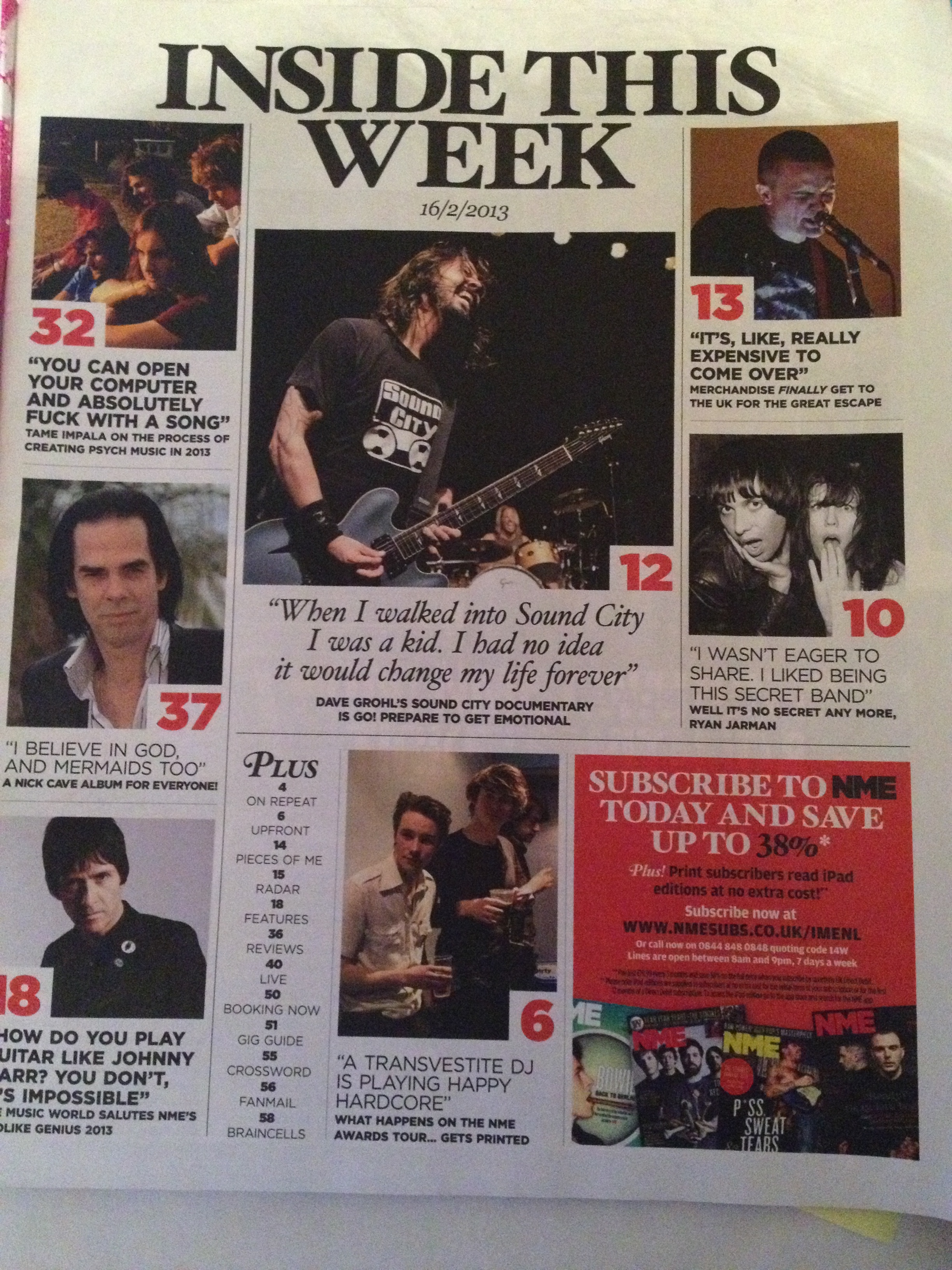
Remaining consistent with the rest of the magazine, the colour scheme keeps to a basic minimum of three colours; black, white and red. This, as previously stated, is to keep things as simple as possible, as the main focal point of the contents page is the photography of the bands and artists featured, so the colour scheme for the page surrounding them has been designed to make these photographs stand out even further. Having the colour scheme as miminal as possible also ensures the page doesn’t look too overcrowded or busy and allows for easy reading and understanding for the younger target audience. Red, the brightest colour in the colour scheme, has been used for emphasis on the most important parts of the small amount of text on the page, such as the page numbers and the small subscription offer/advertisement in the bottom right corner of the page. This choice will have been for the purpose of emphasising the parts of the page that the readers will be most interested in, and also the parts of the page which the editors want the readers to be drawn to the most, hence why they chose to use red for the subscription advertisement, to encourage readers to spend money and, in turn, agree to continuously buy the magazine.
Photography, Text/Picture Ratio and Overall Look
The style of photography on the contents page covers variety of different types and settings; some of the photos are live photography, some are behind-the-scenes candid photos of the bands, and some are extracts from photoshoots of the artists. The reason behind the variety in photography styles is likely to be for the purpose of keeping the contents page interesting and to reflect a variety of content within the magazine; the magazine does not only contain live reviews or articles on live shows, nor does it only contain interviews accompanied by photoshoots, so the variety in types of photographs used on the contents page is representative of the diverse range of features within each issue of NME. This ensures that the contents page gives off the impression to readers that the magazine is full of different kinds of articles relating to different genres of bands and that the features printed range across a broad spectrum. The contents page has been made this way to give potential readers further reason to choose to read NME over other music magazines due to its clear wider variety of content which effectively makes the product more interesting and appealing. Different types of photos are also used depending on the nature of each individual article that they represent. As the target audience for most music magazines lies within the age category of 16-25, and according to my own survey results answered by a similar target audience, it appears to be the case that most of this age category prefer a higher picture to text ratio in a magazine, and this is the ratio that the editors of NME have followed for the contents page, with minimal text and pictures that take up almost the entire page. The youthful target audience of teenagers and young adults prefer to see more pictures than text as they tend to much prefer an aesthetically pleasing and easy-to-read magazine rather than a complex and overly-informative one.
Writing Style
The majority of the text on this contents page is made up of direct quotes from the bands or artists themselves, accompanied by short anchorage lines underneath as a brief description or introduction of the article that that page number is referring to. The writing style of the text is mainly “chatty” and informal, with phrases like “Well it’s no secret anymore, Ryan Jarman” in a sort of reply to the quote that was used from that artist beforehand. The use of this writing style makes the magazine more approachable and relatable for the target audience, rather than something formal and serious. Younger target audiences like the readers of NME tend to prefer a magazine that has a slight touch of humour to its editorial style as this makes the magazine more fun and enjoyable to read and may encourage people to purchase the magazine again in future. A good editorial style is one that makes the target audience feel as comfortable as possible when reading the magazine, and NME have chosen the correct writing style in order to achieve this for their target audience.
Fonts
The fonts used on the contents page vary slightly from the fonts used on the front cover of the magazine. Whereas the fonts on the front cover were more basic, the fonts used on the contents page are slightly more fancy and the fonts used are not consistent across the page, varying in size, capitalisation, boldness and actual font style in different parts of the page. In some cases this variation of fonts could make a contents page or any page in a magazine look slightly messy, however NME have managed to avoid this by keeping the colour scheme basic and ensuring that all text remains black on white, meaning that the variation in fonts simply makes the page seem more interesting and again, reflects the diversity of genres of the magazine by using a diverse range of font styles. Despite the different fonts used, the contents page remains easy to read and not overly complicated to glance at, which makes the page suitable for the target audience who are not likely to pay much attention to the contents page and are simply interested in something simple that will enable them to easily navigate to their desired section of the magazine.