
Above is the rough, drawn-out design for my idea for the contents page of my music magazine. Due to nature and genre of my magazine, I have made the decision to use no photography on my contents page; aside from the fact my magazine is going to be of a monthly frequency and therefore will include so much content that there will be little room on the contents page after the listing of these features, there is also the fact that I want to keep the design of my magazine as simple and sincere as possible, following the attitude that the music it covers carries and to fit with my target audience. I feel that no pictures are needed on my contents page, as the elaborate feel of the magazine will begin from the contents page onwards, throughout all the features full of many different types of photography. My survey results showed that my target audience would much prefer a higher ratio of pictures to text, and although I am going against this idea for my contents page, I will make up for this with my double-page spread which will feature far more photography than text, making the magazine easier to read, understand and approach for my target audience. If I included pictures on my contents page, I feel that the page would perhaps look too busy, and I think minimising the text in order to make room for pictures would destroy the overall look of the page and would also mean my magazine would contain less features, and I am endeavouring to ensure my magazine is great value for money, so the more features it contains, the better! Another important note is that, though this page is going to be almost entirely text, rather than long paragraphs of unapproachable “rambling”, it will instead be simply a list of features, with the band/artist names bolded for easy selection when readers simply want to skip to a particular part of the magazine that they are most interested in.
Another feature of my contents page is the addition of a small amount of information regarding my magazine’s Facebook and Twitter Accounts, along with a website address and QR Code for people with smartphones to scan and gain access to the website in another more modern way. Accounts on various forms of social media along with an official website is very important for a music magazine, as it allows my product and company to expand across other extended media brands, which increases both publicity and revenue, and also allows the magazine to connect with its readers in a more intimate way. Facebook and Twitter is also a cheap, up-to-date and very effective way of promoting my product; once the magazine’s page is followed/liked on Facebook, readers will be able to see and access regular posts and updates about the magazine, its features and reminders of its upcoming issue releases, actively further encouraging readers to buy the magazine when it comes out.
I have also included several sections in my contents page, to further ensure that the contents page is easier to read and understand, maintaining the magazine’s suitability for my target audience. These categories are made up of “On the cover”, “Features”, “Reviews” and “Regulars”. Categorising my contents not only makes it easier for readers to pick out specific articles that they would like to read, but also allows me to shorten the titles of each of the listings, in turn minimising text as much as possible and giving away as little information about the articles as possible, for example having simply a band name as a contents title for a feature, meaning that readers are forced to turn to the page in question to find out more about the nature of the article featuring said band.
Again I have chosen to use the “Varsity” font, as previously mentioned, explained and described, as this is very suitable and appealing for my specific target audience. The repeated use of this font is also allowing me to begin to form a house style for my product ; perhaps this font could be used for every main title in my magazine.
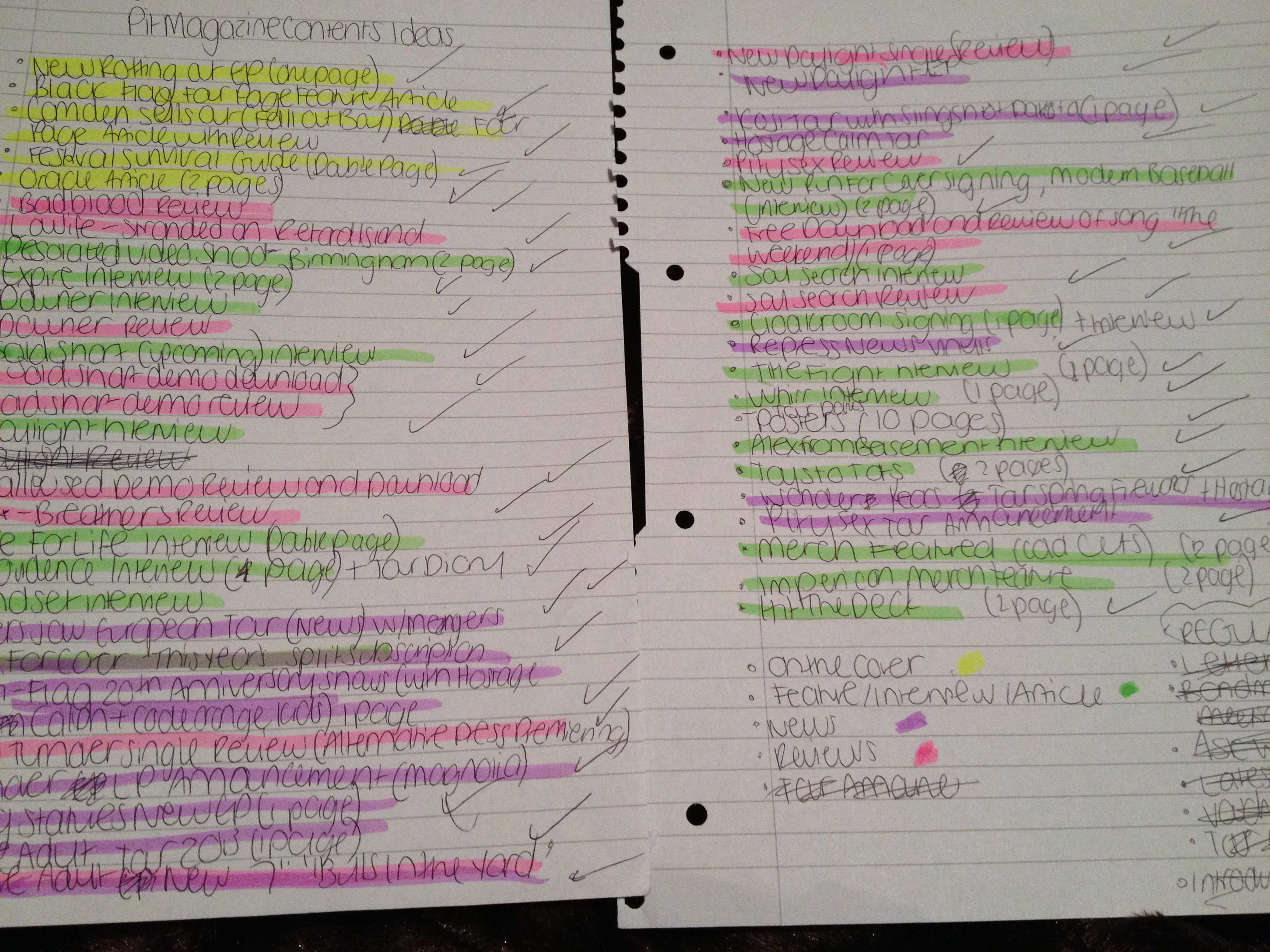 In addition to the physical sketch of my contents page idea, I also wanted to make sure I was organised before beginning to construct my contents page on InDesign, so I decided to make a list of the features that were going to be included in my magazine, before using highlighters to section the large list off into the different categories that I had chosen to separate my contents into, allowing me the opportunity to re-order and categorise them after this process.
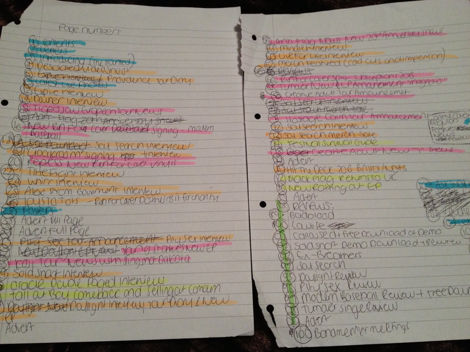
That was the next step in organising my contents page. After the first list I made of raw ideas which I then categorised off, I took new sheets of paper and began to draw up a chronological and final order of the page numbers in my magazine. In most modern music magazines, there appears to be little to no structure in the order of articles other than in the contents page; there will often be many main articles mixed in with news articles, posters, adverts, interviews and other features in no particular order other than their categories on the contents page. This is also the approach I chose to take with my magazine. After devising my final order of pages for my magazine, I then used my highlighting technique once again to allow me to place each article in its correct category on my contents page. This planning and organisation helped me enormously when constructing my contents page as it made the very large amount of features and content far easier to deal with and arrange.
