I used Adobe Photoshop CS5 software to edit the photos I chose from my contact sheet. From analysing other magazines of similar music genres, I was able to take note of the way in which their photos and central images on the front covers were edited; unlike mainstream glossy magazines which use a high level of editing in order to give their central images a flawless and “airbrushed” effect, most music magazines stick to simple methods of enhancement, including alteration of brightness and contrast, alteration of saturation, hue and exposure, and also simple, brief touch-up methods on the complexions of the people in the photo to improve the overall look of each raw image and help to make the magazine look more professional.
I tried to adopt a similar process when editing my own photos; here I have provided an in-depth look at how I edited my main central image for the front cover of my magazine.
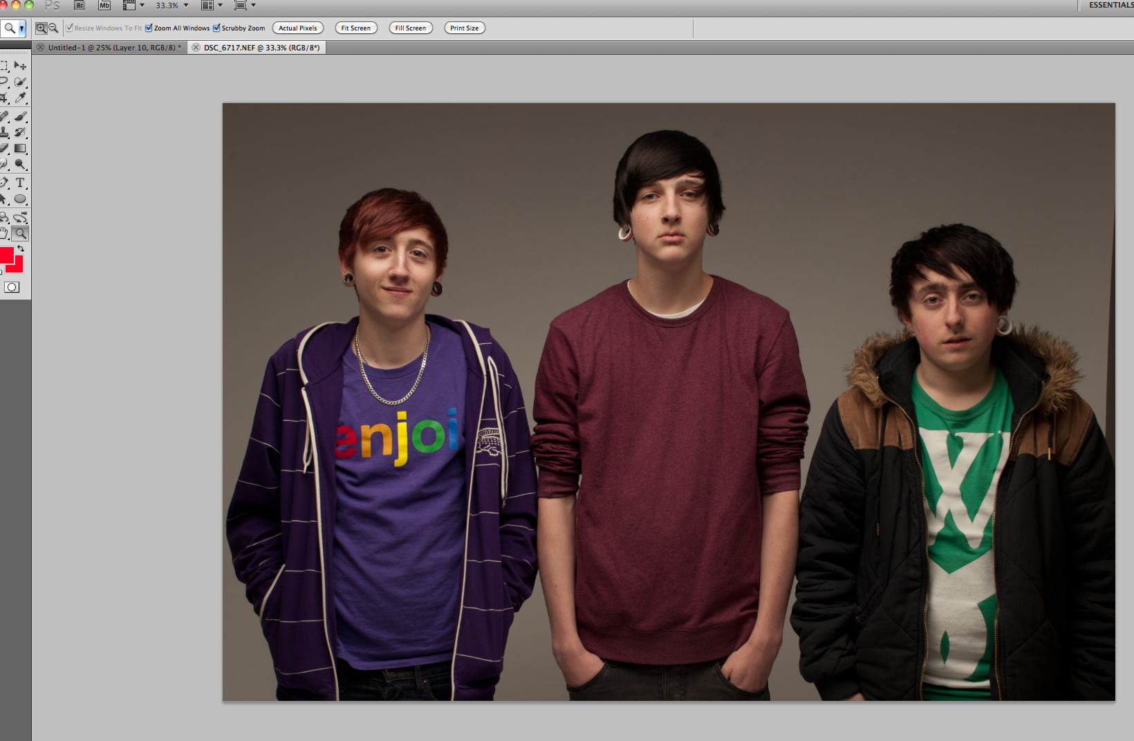
First of all, I opened my raw image in Photoshop, selected the magnifying tool and chose the option to make the photo “fit screen” in order to make it easier for me to see my entire image and decide upon what I was going to do next to improve it.
The first step I took to edit my photo was using the ‘Spot healing tool’ to subtly remove any small imperfections from the complexions of each of the boys’ faces, including any small areas of discolouration, blemishes or noticeable moles, without making it look as if I had airbrushed their skin completely. I left in any eyebags and lines on their faces as I did not feel it was necessary to completely airbrush their skin as most music magazines do not use this method, they merely overexpose the photos and remove any small imperfections to improve the look of the image overall. The ‘Spot healing tool’ is simple to use and simply requires a change in brush size and then one click with the mouse to effectively ‘heal’ one small area of their skin and remove the imperfection.

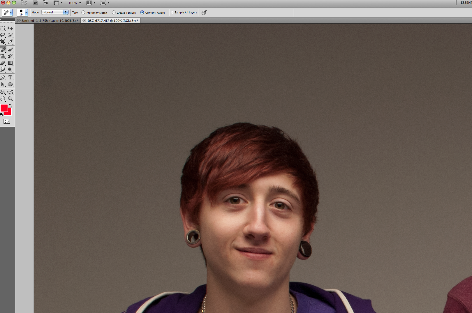
Here you can see how Ben’s complexion looked once I had completed spot-healing any blemishes he had.
I used the same method to remove any obvious blemishes and imperfections from Jack’s face to give his complexion the same neat look without making him look overly and unrealistically flawless. The idea of the editing process I chose to use is to ensure that the photos do not even appear to have been touched up at all; every editing process I use must appear to be a subtle as possible to avoid being noticeable.

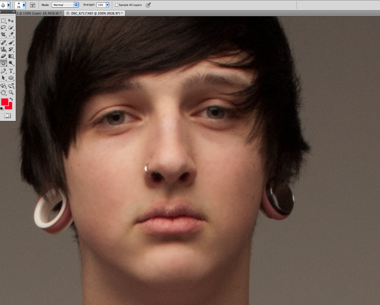
After using the spot-healing tool, I evened up the complexions of the boys even further by using the blur tool, pictured above, to give an extra smooth effect to their skin and to help blend in any discolouration. Although the blur effect appears far more obvious and less subtle than simply the spot-healing tool, I was fully aware of this and made sure to focus my next step on altering the image as a whole to cover up any pre-editing I had done.
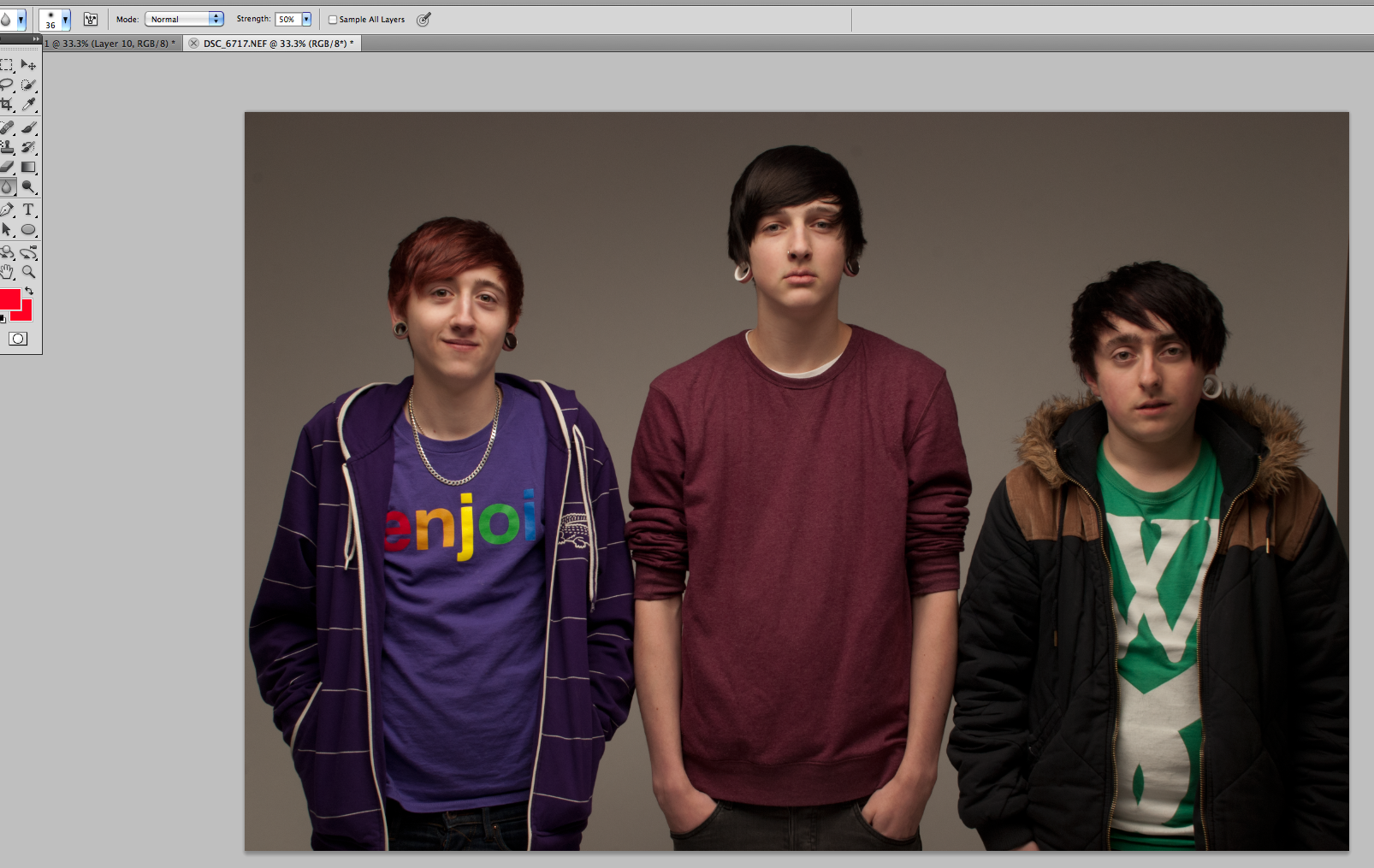
This screenshot shows the full view of the photo after the spot-healing and blur tool editing process, with each of the boys’ complexions appearing smooth and without any obvious flaws, but maintaining a fairly natural appearance.
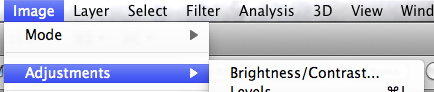
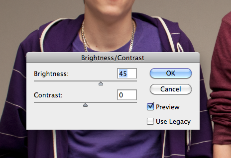
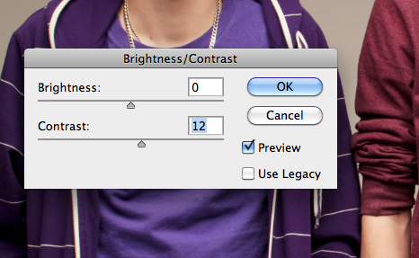
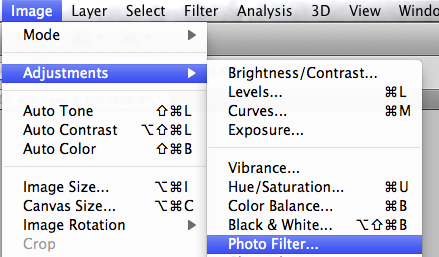
By going to the top toolbar and selecting “Image>Adjustments>Brightness/Contrast…”, the next step I took in editing my image was altering the brightness and contrast. Doing this gives the image a look of a higher level of exposure and also makes the image appear sharper and of a higher quality. An increase in brightness and contrast makes the image stand out more, and the increase in brightness in particular is a further method of covering up and evening out any imperfections on the complexions of the boys faces when used after a pre-touch up with the spot-healing and blur tools. I made sure to limit how much I increased my contrast, as a level of contrast that is too high can make the image appear far too over-exposed and gives the picture an unprofessional look that does not follow the conventions of other music magazines.
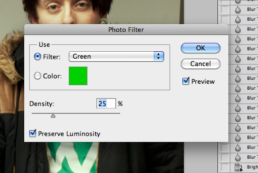
After smoothing out any imperfections and making my photo much brighter and of a higher quality and slightly sharper appearance, I was still not fully happy with the way my photo looked in terms of colours. Since the colour scheme of my magazine is black, green, white and orange, and I was not able to control what clothes the band in my photo wore for their photo shoot, I had to decide upon an alternative way to make my image complement and fit with my colour scheme. I decided to add a subtle green photo fitler with a fairly low density to ensure that again, the editing technique I had used was subtle and was not possible to be noticed.
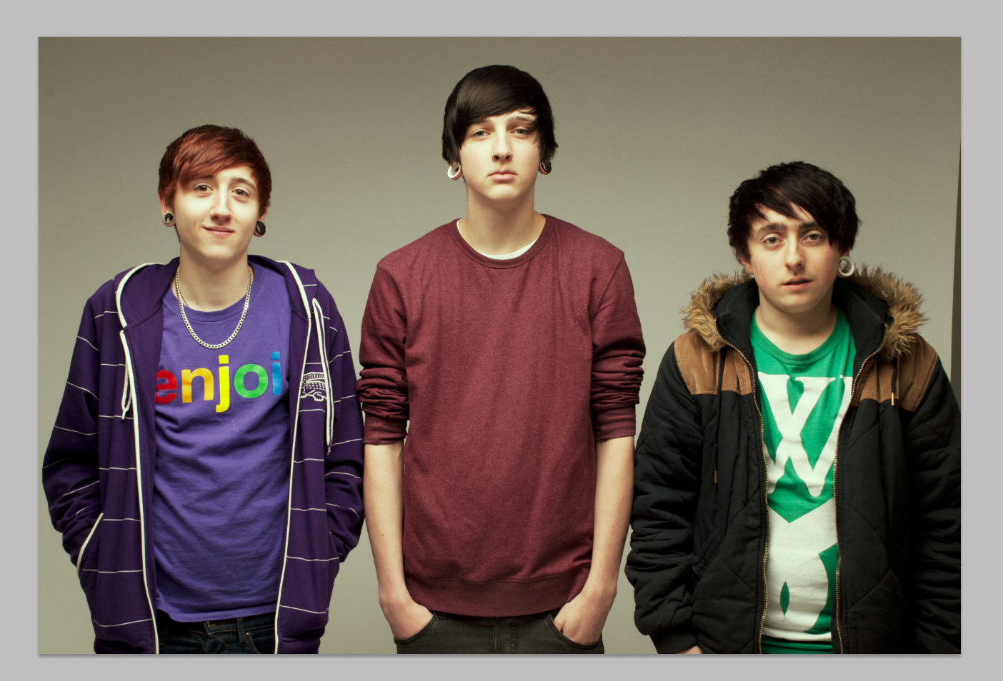
This shot shows my entire image after the first four steps I took for my editing process, a look that I was very happy with. However, cropping was still required to ensure that my image looked as professional as possible. For example, the most obvious part of the photo that needed to be cropped was the part that showed the wall of the room behind the white backdrop in the studio to the left of Sam (the third boy along).
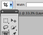
The crop tool found on the left-hand toolbar allows me to get rid of parts of my image which I no longer need and to trim the edges. The following two screenshots show the process through which I gradually cropped more and more from the left and right edges of the photo in order to even the image up and make it appear more professional by ensuring that the boy in the centre of the photo, Jack, was in fact in the centre.

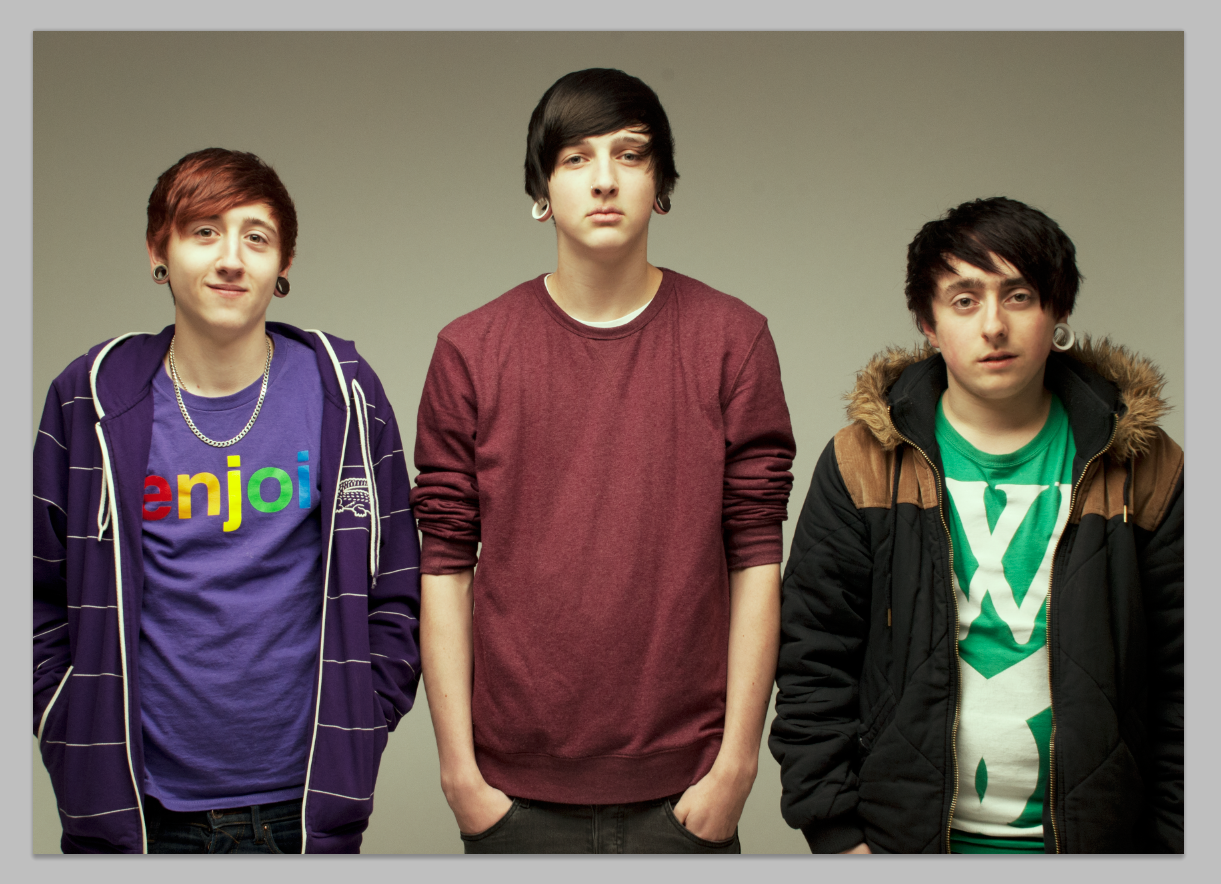
The screenshot below shows my final edited image completed.

