Using screenshots to detail each step I took during the process of constructing the Front Cover of my product, I will explain the methods and techniques I used.
To start with, I opened up a new blank document in InDesign and kept it to one standard page as this is going to be the basis of my A4 size front cover page.
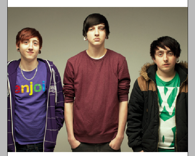
I then chose to add in my edited photo before taking any other steps, as the main central image is to be the focal point and arguably the most important part of the front cover of my magazine. I clicked and dragged my chosen final image from where it was saved onto my desktop over to my InDesign document, and proceeded to rezise it slightly and using the ‘Fitting’ option when right clicking the photo to make slight changes so that the photo fit proportionally both within its frame and on the page without making the image look stretched or bad quality. Since the photo is horizontal, I chose to position it relatively close to the middle of the page to allow me to place bands of colour or text above and below it, making this decision with a rough idea of my final product in my head.

I then used the rectangle tool to drag out a rectangle “banner” above the photo at the top of my page, to create a background onto which I was later going to place my masthead. The rectangle fit the page exactly with no white space around it or between the banner and my central image.


I wanted my banner to stand out, make the page look more exciting, eye-catching and colourful yet I wanted to maintain a general house style and colour scheme throughout my entire magazine that was tailored to my target audience, and for this reason I chose to colour the rectangle in a shade of green that fit with the ‘Varsity’ font and style of my magazine and front cover. I also found this shade of green to be sufficiently eye-catching yet still subtle and not too bright or garish.

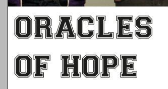
For my masthead I knew that I wanted to use the Varsity Font, however when text in this font is capitalised, the border/stroke around the edge of the text is transparent, and for my masthead to ensure that the letters stood out I wanted the border to be white. In order to achieve this, I opened up Photoshop and the paint tool to paint a plain white background.

I then used the text tool to type out the word ‘Pit’ in capital Varsity font on top of the white background. The white that was behind it then showed through the transparent border to create the look I wanted.

I then used the magic wand tool to select the entire white background around my text, and then deleted it so only a few white pixels remained around the outside of my letters and the white border remained as a stroke on the letters.


I then used the zoom tool to zoom much further in so I could see the white pixels surrounding the letters more closely to enable me to be more precise when removing them. I chose to use a soft round erase tool with a very small brush size to erase the white pixels without removing any of the black border.
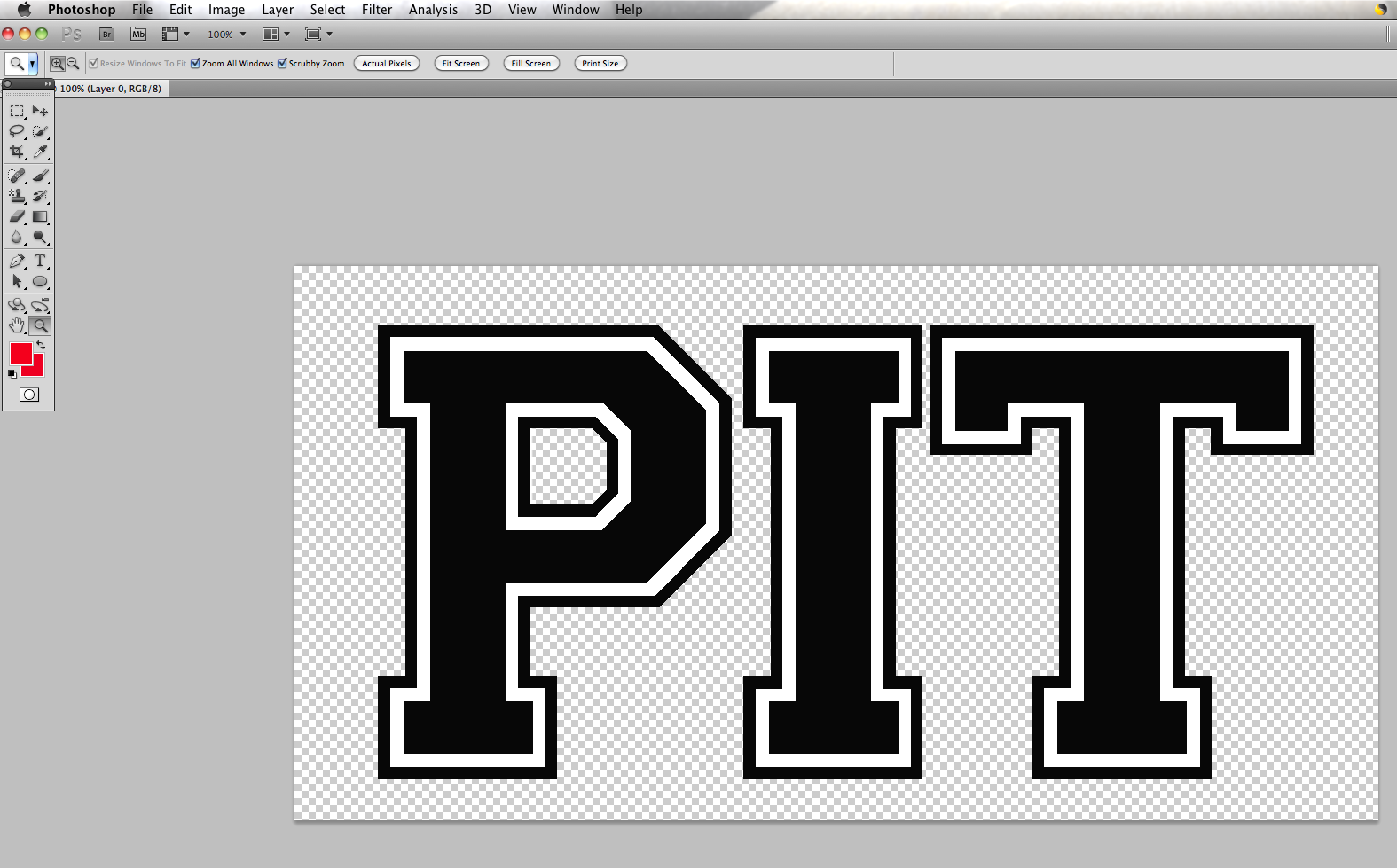
Once the whole background had been precisely and accurately erased, I was then able to use the crop tool to cut down the size of the whole document so that the transparent background was not too large.
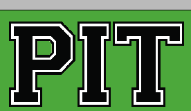
I then saved my completed logo as a high quality PNG file onto my desktop to allow for an easy import by clicking, dragging and dropping the picture into InDesign and placing it in its appropriate place on my top green banner.
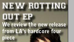
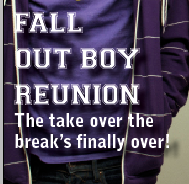

I then used transparent rectangles once again to create text boxes to insert all my secondary coverlines. Keeping with the magazine’s house style and fonts, I chose to use the Varsity font again for the main titles and then Bell Gothic Std, a simple and easy-to-read font, for my accompanying captions.
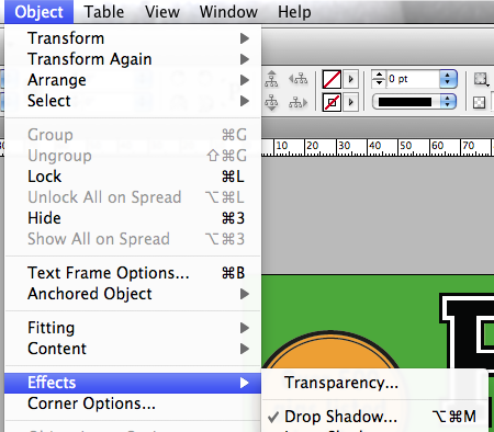
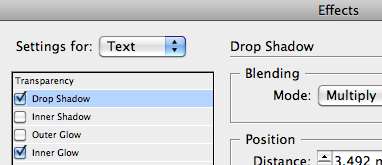
Since I was typing in white text over the top of a picture, my text did not originally stand out to my liking. To improve its appearance I selected ‘Object’ > ‘Effects’ > ‘Drop Shadow…’, then specified the settings to be applied to the text, and then chose the Drop Shadow and Inner Glow options and altered the opacity of the shadow until I was happy with the way the text now looked and stood out over the top of the picture behind it. I followed this method for each of my secondary coverline text boxes.
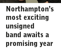
I had a large white space below everything else on my page and had yet to have completed my main coverline to match my central image, so I used this white space for the coverline and its coverline caption. To maintain a constant house style and use the same fonts throughout the magazine, I again chose to use Bell Gothic Std for my coverline caption as this kept the front cover looking neat and consistent. I chose to keep the colour of the text black as this looks effective over the top of a white background and the use of any other colour alongside my already colourful page would have made the front cover look too bright, messy and garish. A monochrome colour scheme to compliment the varsity colours keeps the magazine looking fresh and subtly eye-catching.
Keeping in line with the house style and chosen fonts for my magazine, I used the Varsity Regular font once again for my main coverline, keeping the letters capitalised for maximum impact and to make the coverline stand out above the rest of the text on the page since the main feature is intended to attract and draw in potential readers.
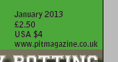
As I had not yet included any details of price, issue number and other necessary details often found on the front covers of magazines, I chose to place this information to the right hand side of my top green banner to fill up some blank space. Since the magazine is also going to be distributed in the US with its large content of US bands, I felt that it was necessary to include the US equivalent price for the magazine on the front cover.

The magazine’s front cover looked like it had something missing and had too many secondary coverlines, making the overall look appear messy and unattractive, so I chose to take away one of the secondary coverlines, alter and move around a few of the objects on my front cover to then create some extra space at the bottom so that I could include the deleted secondary coverline as a banner across the bottom of my page. This technique is very common and follows the conventions and techniques of other music magazines on the market.


To ensure my banner stood out as much as possible and looked neat and tidy alongside the white space where my main coverline and its caption were positioned, I chose to include a border around the black box. Following my ‘Varsity’ style colour scheme, I used a shade of orange that complemented my chosen shade of green well and accurately represented the ‘Varsity’ style and overall look that I was trying to achieve.
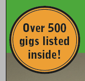
I used the same shade of orange to colour a small puff that I created towards the top left corner of my front cover to fill up some blank space, to make use of this technique that many other music magazines on the market use and to follow conventions. Choosing the same shade of orange for the puff that I chose for the border of my bottom banner keeps the front cover looking consistent and maintains my house style.

Finally, to complete my front cover and fill up the last piece of blank space, I included a barcode and rotated it onto its side, following the conventions of other music magazines and the positioning of their barcodes.
