In this blog post I am going to discuss the methods and techniques that I followed and used in order to construct my contents page.
First of all, I opened up a new blank A4 document in InDesign as my contents page is going to A4.


I then selected the Rectangle tool on the left hand side toolbar of InDesign and dragged out a rectangle the same size as my A4 page, selecting the fill and border to be both jet black in order to completely fill my page and create a background for the rest of the content. I chose a plain black background as I felt that any white or coloured text would work well over the top in order to make the content of the page stand out.


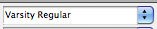
I then had to create the main title for my contents page; I used the rectangle tool to drag out a text box for the words, changed the colour of the text and border so that the text was white and and the border was transparent and then typed in my chosen title. Keeping in line with my current house style and chosen fonts, I used capitalised Varsity Regular letters to create the title, positioning it at the top of the page.
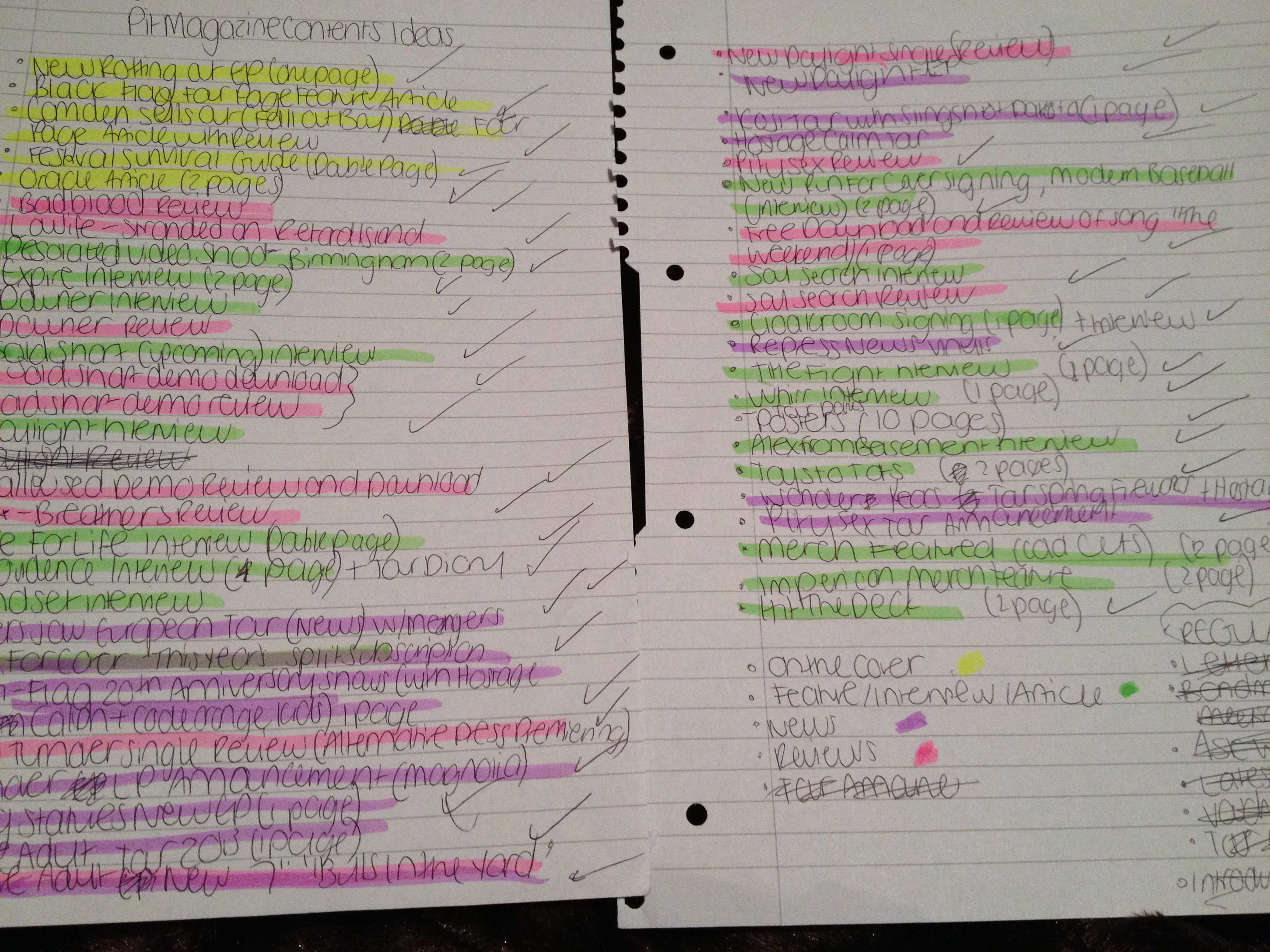
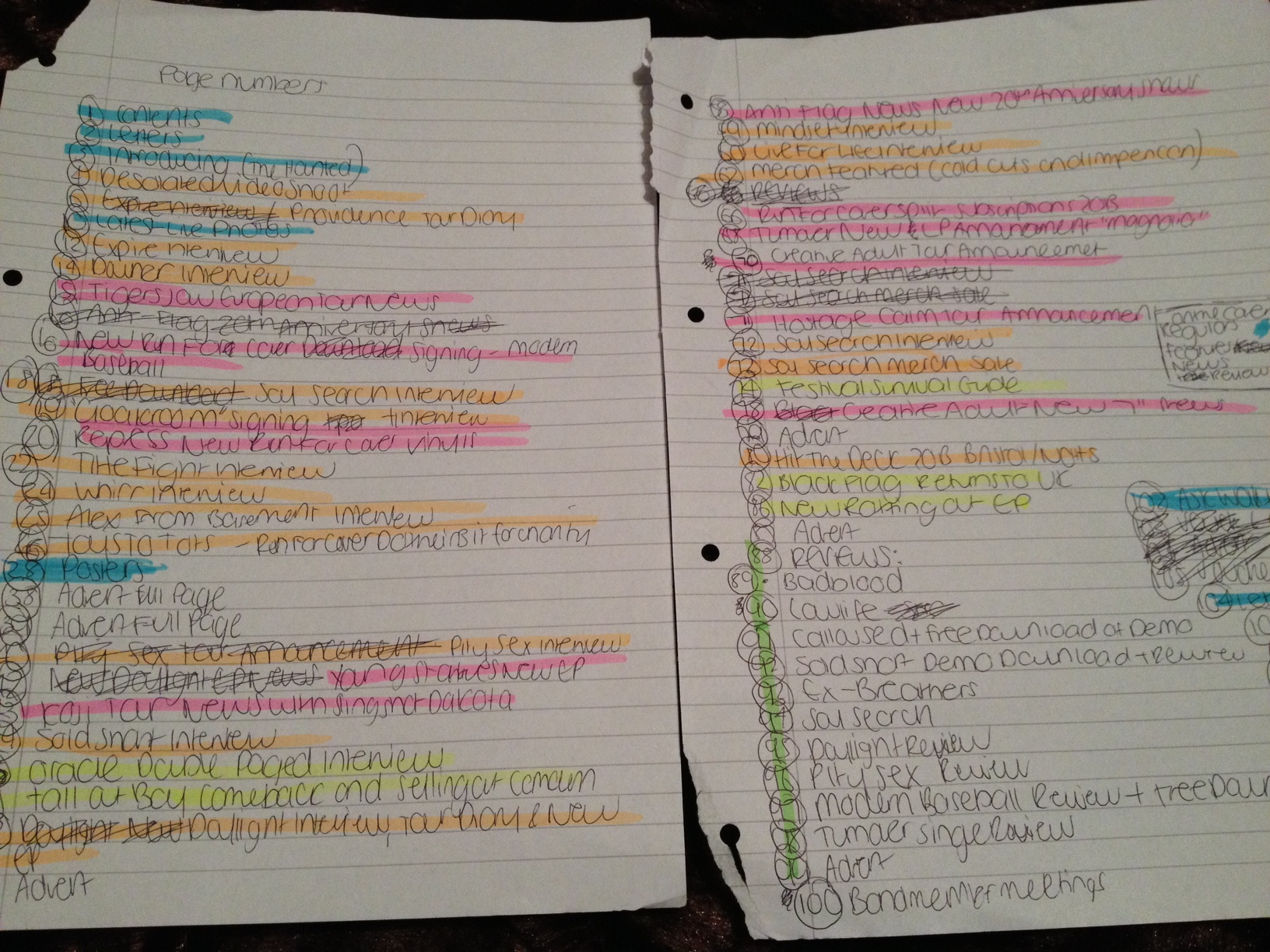
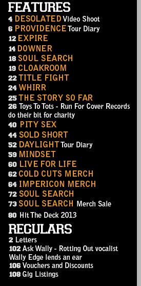
Once my main title and background had been created, I then had to work on the real content of the page and my page listings. Since my magazine is going to be of a monthly frequency and I want to make my product good value for money, I wanted to include as many pages and as much content as possible, falling into several different categories of news, main features, reviews and then regular features which appear every month in the magazine. These types of sections follow the conventions of many other music magazines on the market, in addition to also catering to the needs and wants of my target audience according to my previous survey results in which my audience stated that they would be interested in reading a combination of news, interviews, general features and reviews. In order to effectively organise myself and prepare to put the page listings onto my InDesign document, I decided to prepare myself on paper initially, listing out all my ideas before putting them into an order, sectioning them off and colour coding them, using highlighters, into appropriate categories and trying to ensure my content was as diverse and has as much variety as possible.
Once this list was completed I was able to efficiently lay out my contents page and begin creating each section.


Using the Varsity Regular font once again, keeping the page consistent with my house style, I created small text boxes (with transparent fillings and borders) where I could type my contents category titles such as ‘On The Cover’, ‘Features’ etc. I chose to keep the titles white as this colour of text looks effective and stands out over the black background of the page.
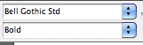


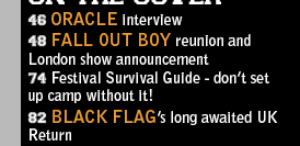
I wanted to ensure I used as few fonts as possible throughout my magazine to keep a clean, neat and consistent house style, so for the majority of the text on my contents page, with the exception of the main title, the category titles and the page numbers, I used Bell Gothic Std which is the same font that was used for similar kinds of text on my front cover. I altered the font sizes several times throughout the construction of the page listings as I had to ensure that all the page listings would fit on the page without looking messy or overlapping any other objects. I settled with using 12pt, with the band names capitalised and in 15 pt for extra emphasis and to make these stand out above the rest of the text on the page.
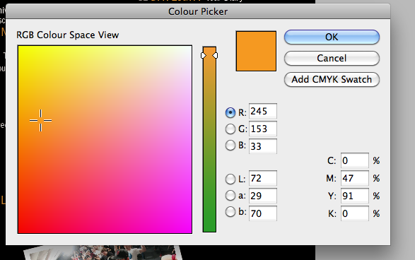
For further emphasis and to add some colour to the page to liven up the monochrome colour scheme, I chose to also make the band name text orange. I used the same shade of orange that I used on my front cover, to maintain a consistent colour scheme and also my ‘Varsity’ look that I was trying to achieve for my whole product.
I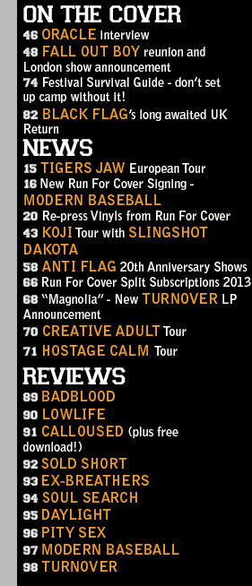
After a few alterations which involved changes in font sizes and moving some of the text boxes around to ensure the page listings fit neatly on the page, my contents page listings, which made up the majority of my page, were finally completed.

I then had a large amount of blank space that need to be filled up so I decided to create a new layer (an action I had been previously taking every single time I added or created a new object such as a text box), onto which I was going to start adding photos to my page.
![]()
I wanted to create a look for my photographs that gave the impression they were small polaroids/cut outs that were sat on top of the page. To achieve this I first created a small plain white rectangle.
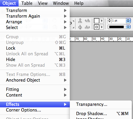
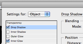
To ensure that the white rectangles looked as if they were almost 3d and stood out above the page as if they were separate, I selected Object > Effects > Drop Shadow… and selected the Drop Shadow and Inner Glow options for my object, which was my white rectangle. Although initially my first white rectangle did not look any different as the drop shadow was invisible on top of the black background, I knew that later on once I had created more of the white rectangles that I could place and arrange them on top of each other, after which the shadow behind the objects would then be visible and the desired effect and result would be achieved.

I then used the Rectangle Frame Tool to drag out a frame for my first on top of the white rectangle. I had taken 5 of my own photos for my magazine which I used across my front cover and double page spread pages, however I knew that, in order to follow conventions of other media products that fall into the same genre as my music magazine and to give off the impression I desired to give with the style of my music magazine, the only type of photography that would have been appropriate for my contents page would be live music photography. I had not had the opportunity whilst creating my music magazine to take my own live music photos, so therefore I had to find them elsewhere on the internet from other sources. I found some suitable live photos of some of the bands that I had stated were featured in the magazine and saved them onto my desktop for easy access.

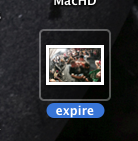
I dragged my photos over to my photo frame straight from my desktop as this was the easiest method to follow to ensure my photo fit correctly inside of its frame.
I then right clicked on my photos and chose the Fitting > Fit Frame Proportionally option to ensure that my image fit correctly inside its frame without being stretched, pixelated, oversized or cut-off at any points.

To emphasise the ‘polaroid’ style of my photos, I decided to caption them with text that looked as if it had been ‘scribbled’ onto the polaroids as labels. I created a small text box with the Rectangle tool, ensuring it had transparent borders and filling, and then found a font that suited the style I wanted to achieve. I chose ‘Chalkduster’ and then proceeded to label up each of my photos once I had created each white rectangle frame and imported all my photos from my desktop through a simple click-and-drag method.


I then selected each part of my ‘polaroid photo’ (the actual photograph, the text box and the white rectangle behind them), using the shift key to select multiple objects at once, and then right clicked and selected the ‘Group’ option to make each part into one whole object that I could easily click, drag and move at once.
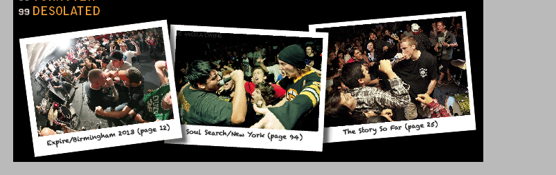
Once I had made each of my photos and their extra parts into groups that I could move all at once, I then rotated each new complete object to make them sit at a slightly canted angle to further emphasise the look and give off the impression that they had just simply been placed on top of the page, and then moved each photo so that they all overlapped each other slightly. This also then allowed for my drop-shadow effect on each ‘polaroid’ to become visible on top of the photo underneath it.

After this, I then had a little more extra space at the top right corner of my page underneath my main Contents title. Since I had not yet included any form of contact details on my contents page, I decided that this would be an appropriate place to slot these in.
Using a similar method to my ‘polaroid’ photos, I created three small photo frames, positioned on top of each other into a list arrangement, into which I dragged in small logo thumbnails of each of the social networking sites that I had found on the internet and saved onto my desktop. I then captioned them with the appropriate website addresses that I had fabricated to suit my magazine and its title, using the same Bell Gothic Std font that I had used for the majority of the rest of the page.
![]()

In order to make this part of the page stand out above the rest, as my text was in the same font and colour as much of my page listings, I chose to use the ‘Black’ version of the font as this made the text appear bolder.
By creating this social networking section of my contents page, I was following the conventions of other music magazines on the market that also have Twitter, Tumblr and Facebook pages for their products as social networking is an enormous and very significant and important part of modern marketing for media products such as music magazines.
