Archives for category: Construction

With the help of screenshots of every step I took in the process, in this blog post I will be discussing the method and techniques I used to construct my double page spread.

Screen shot 2013-03-27 at 16.12.08

First of all, I opened up a new blank document in InDesign, and specified the size and layout to an A3 landscape page, as this amounts to the equivalent of two A4 pages to create my “double page” spread.

Screen shot 2013-03-27 at 16.12.21

I then dragged guidelines out onto my page from the ruler on the lefthand side of the program, in order to effectively space out my document to make it easier to align each aspect of the document such as the text columns and photos so I can give my magazine a more professional look.

Screen shot 2013-03-27 at 16.12.32

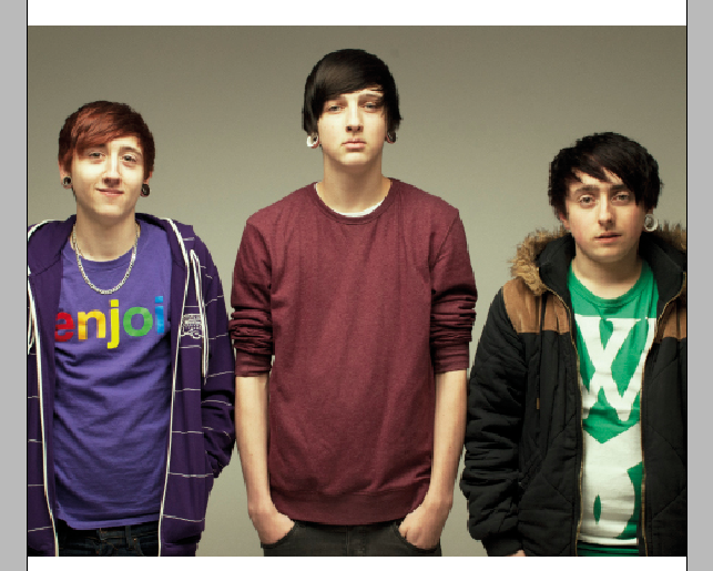
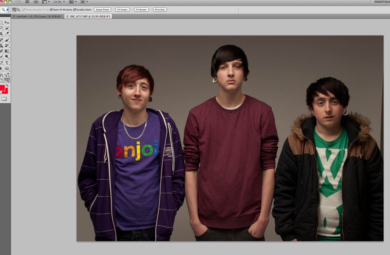
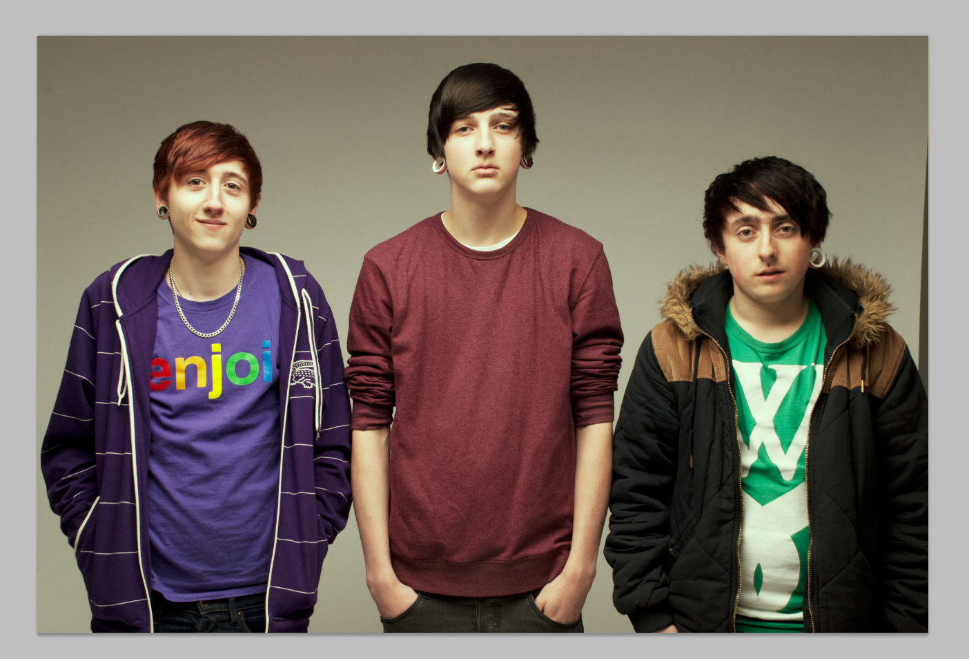
After this, I clicked and dragged one of final images, which I selected and edited for use on my double page spread, over from my desktop to my InDesign document, and then proceeded to resize it slightly, make it fit proportionally within its picture frame before moving it to the corner of the document where I had decided to place it. This is to be the main central image and focal point of the spread.

Screen shot 2013-03-27 at 14.22.58

For all but one of my images, I chose to adopt a “scrap-book” style approach for the design and layout of the photography on my page. After research on other current magazines on the market, I discovered that many other magazines often use this method which effectively gives the magazine a more approachable and relatable feel overall for the target audience; the scrap-book look makes the photos look as if they have been printed and cut out and stuck into a scrapbook by the band themselves, rather than a more professional approach. The nature and style of the candid, naturalistic photos combined with the scrap-book like design of the layout of some of the photography on the page makes the reader feel as if they can relate more to the band members themselves and be inspired by them. This approach will appeal more to a younger, teenage target audience, which corresponds with my target audience that falls under the age category of 16-25 year old males and females.

In order to achieve this look, I chose to put all but one of my images onto a white rectangle in order to make them look as if they had been cut out and stuck onto the page. I used the rectangle tool to drag out a potential shape to fit my photograph onto.

Screen shot 2013-03-27 at 14.23.04

Screen shot 2013-03-27 at 14.23.25

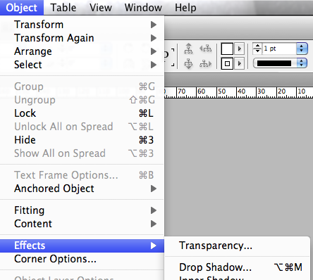
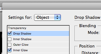
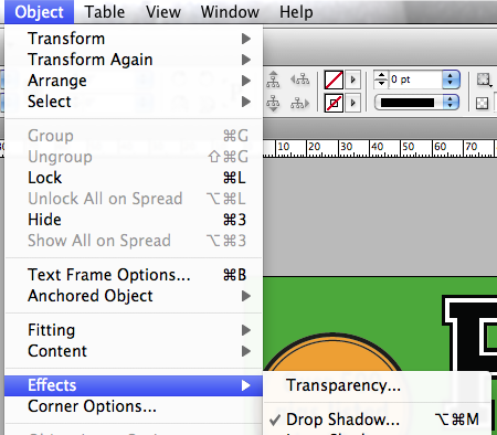
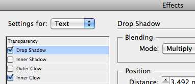
I then went to “Object>Effects>Drop Shadow..”, with my rectangle still selected, and gave my rectangle a shadow behind it, which gives it an illusion of being placed on top of the page as if the photo is separate to the magazine page.

Screen shot 2013-03-27 at 14.23.37

Screen shot 2013-03-27 at 14.23.52

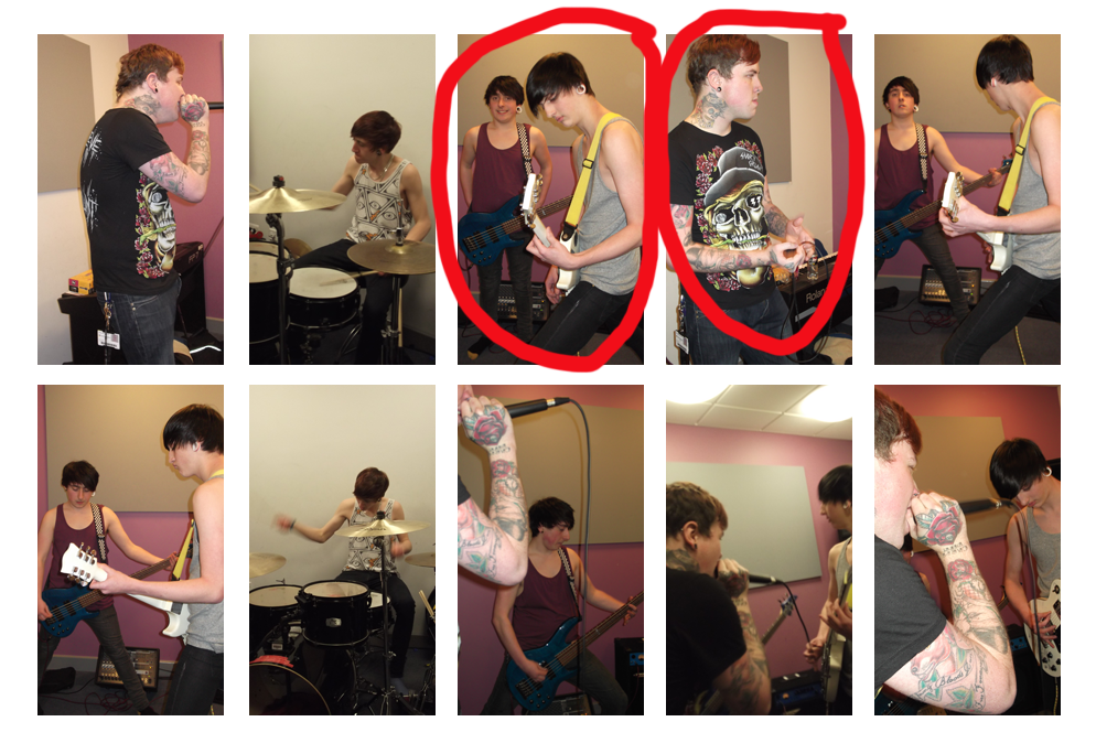
I then used the Rectangle Frame Tool to add a picture frame into the middle of my rectangle in which to place my smaller photograph.

Screen shot 2013-03-27 at 14.24.12

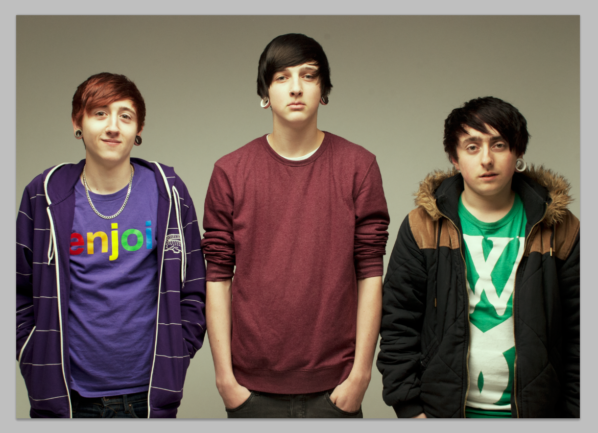
Then, using a similar method to my first photo, I clicked and dragged my second image from where it was saved on my desktop across to InDesign and placed it within my picture frame on the white rectangle.

Screen shot 2013-03-27 at 14.24.23

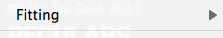
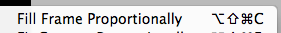
I then right-clicked the image and selected “Fitting>Fill Frame Proportionally” in order to make sure my photo fit evenly within its frame without losing its proportions or worsening the quality of the image.

Screen shot 2013-03-27 at 14.30.15

After a few tweaks of re-sizing and moving and re-fitting my photo into its frame, I clicked and dragged to select both the rectangle, the frame and the photo inside of it all in one go, and then used the key command CMD + G to group these three objects together. I then hovered over an outer corner of the image and clicked and rotated the photo to be slightly on an angle, in order to further emphasise the look of the photo being separate from the magazine page and giving it a “cut-out” and “scrap-book” look.

Screen shot 2013-03-27 at 14.38.51

Screen shot 2013-03-27 at 15.49.47

Screen shot 2013-03-27 at 16.52.18

After some moving around of my two photos and after adding a new layer with four large rectangles for use as text columns, I was ready to add my double page spread article. I copied and pasted the text into the frames, with much alteration of text size, moving text from one frame to another and also bassline shifting (using the ‘Bassline Shift” tool located on the top toolbar in InDesign), I finally succeeded in arranging my text correctly, with all columns completely aligned and all text justified and de-hyphenated.

Screen shot 2013-03-27 at 15.05.32

After doing research of other magazines on the market, I found that a technique commonly adopted by magazines for the purpose of breaking up the large body of text in the article and also to highlight key areas of the article or interview is the use of pull quotes. These are certain phrases within the text, copied and ‘pulled’ out and written somewhere within the middle of the body of text near the quote itself, made larger and emphasised in some way. This makes certain important parts of the text stand out to the reader upon glancing at the article, to give them an idea of what they are about to read and to help entice them into the article by showing them the most exciting parts before they even begin reading from the start.

In order to use pull quotes in my double page spread, I had to make space within my text by shifting around columns, spacings, shifting over text to other boxes and moving around the rest of the objects on the page carefully so that I could create enough space without ruining the alignment and overall layout of my spread.

Screen shot 2013-03-27 at 15.13.37

Screen shot 2013-03-27 at 15.19.28

Once I had managed to do this, I used the rectangle tool again to create a box in which to put the text for my pull quote. I then made sure to use the same Varsity font that I have used throughout the rest of my magazine for any headers, titles and important and emphasised text to write my quote so that I maintained a consistent house style, and typed in my pull quote in speech marks to show that it is a direct quote from one of the band members. I also then did the same thing on another part of another body of text, using the same method to make space within the text and to type in another pull quote in my chosen font style.

Screen shot 2013-03-27 at 15.15.12

I then used the line tool to draw two vertical lines either side of my pull quotes, just to act as a separator from the quote and the rest of the text. I have seen this separation technique used for pull quotes in other current magazines so I mimicked the method in my own way to conform to the rest of the market.

Screen shot 2013-03-27 at 15.28.06

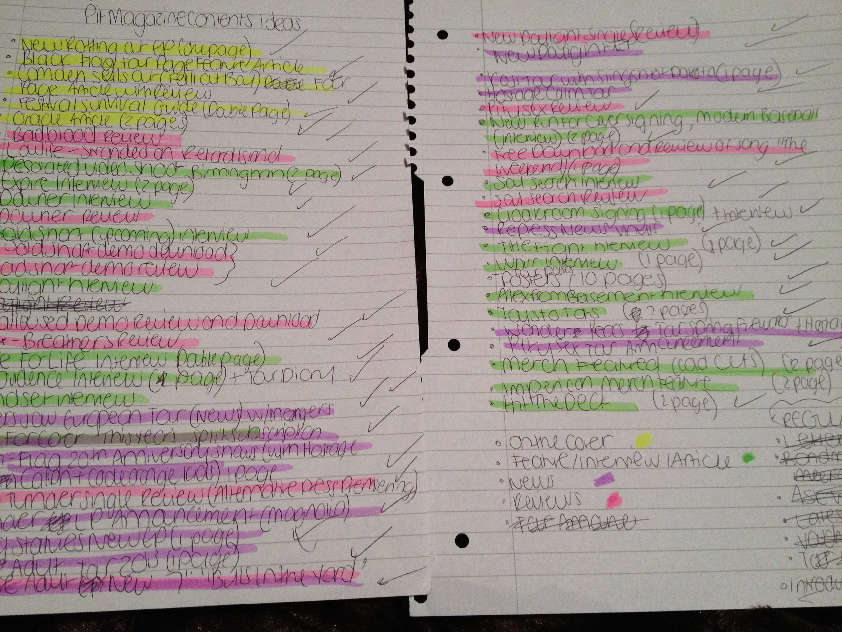
This shot shows my completed pull quotes within the text on my double paged spread as a whole.

Screen shot 2013-03-27 at 15.30.01

Another technique used by many other magazines on the market that I chose to take inspiration from is the use of a small bolded, emphasised or highlighted piece of information at the end of an article for the purpose of giving the feature closure and also to further inform the reader of extra facts about the band, usually details of an upcoming event or music release. I did this by using a similar technique to that of my pull quotes; I made space at the end of my article by shifting around text within the boxes, and then created a rectangle with no outlines before typing in my information in the same text as the rest of the article, but bolder and capitalised for emphasis and to make it stand out above the rest.

Screen shot 2013-03-27 at 15.49.23

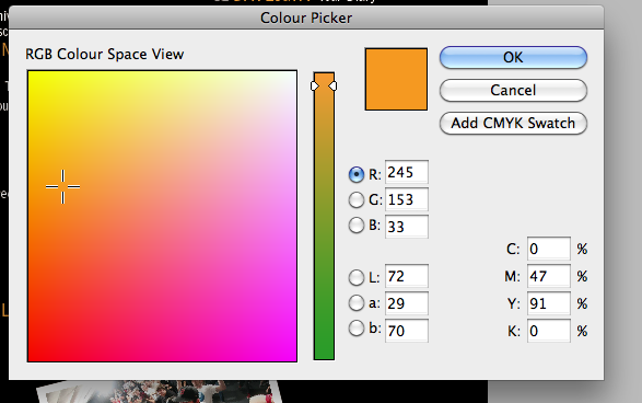
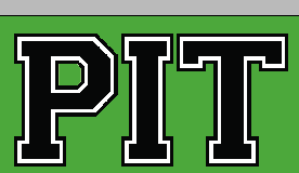
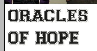
The next step I took was the creation of my masthead for my double-page spread. I chose to position my main title on top of my main image, as this technique is commonly used in other music magazines. Keeping consistent with my magazine’s house style and colours and fonts, I again used the Varsity font and chose to colour the text in orange to fit into my colour scheme, and also to add some extra colour to the page to complement the plain black-on-white text on the rest of the spread. I centered the text to create a better look and fit across the bottom of the picture.

Screen shot 2013-03-27 at 15.49.53

Then, for extra emphasis and to ensure that the masthead stood out over the rest of the text and the rest of the page, I selected ‘Formatting effects text’ on the lefthand toolbar before choosing to add a stroke of black as an outline to the letters of my title.

Screen shot 2013-03-27 at 15.50.43

I then changed the weight of the outline for further emphasis to really make the text jump out at the reader. The bolder and more noticeable the outline, the more the text fits in with the ‘Varsity’ style.

Screen shot 2013-03-27 at 15.52.47

Screen shot 2013-03-27 at 16.11.00

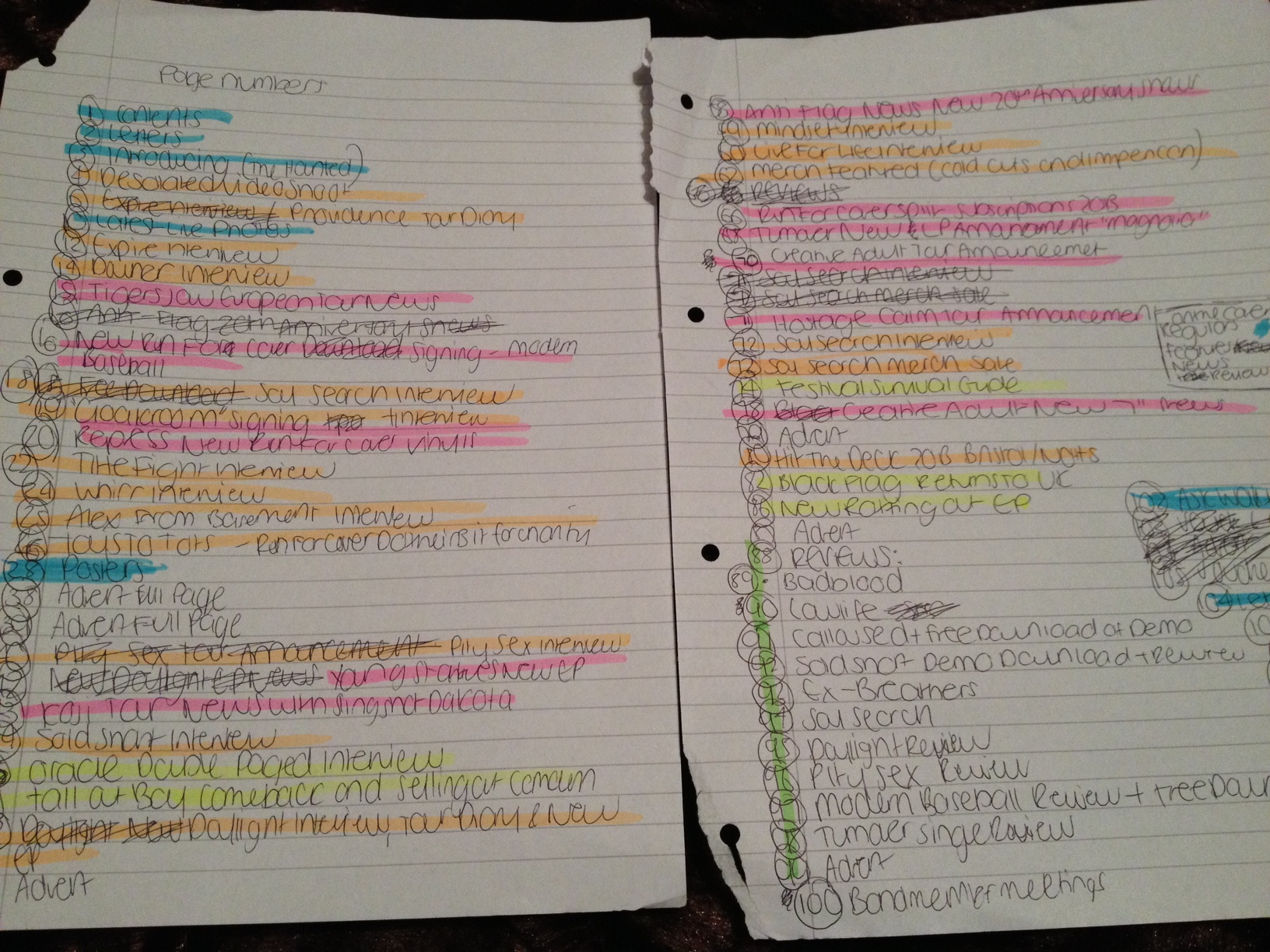
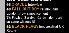
I then needed to add in the page numbers at the bottom of the page. To make it easier for myself, I simply copied and pasted the number over to the other side once I had added in one number to ensure that I kept the same text size, justification and level of bassline shift. I made all of these adjustments for the purpose of ensuring that my page numbers were large enough to read but stayed within the page boundaries and did not overlap the article text.

With the vast quantity of small, unsigned bands crawling out of the woodwork left right and centre these days, few are lucky enough to have the right amount of talent, skills, connections, support and pure luck to be able to bag themselves a record deal and truly make it. Oracle, however, a melodic hardcore four piece based in Northampton, have been a band for a mere few months and are already beginning to make a name for themselves in their hometown. “It was a new project, something we’d never been able to do before,” explained Jack, the band’s guitarist, when asked about what inspired them to form Oracle. “It meant more to us than just a college band.” Although Jack Munton, 17, has been playing guitar for seven years, it was around two years ago that he realised he wanted to take his skill further. With all but one of the boys studying Music Technology at college, and with a few attempts at playing in bands and writing their own songs previously, they finally realised that they worked well together as a unit, and the strong friendship held between the boys is undoubtedly what has helped them make so much progress and achieve such success at their level in such a short period of time. “We’ve made a massive bond between us that has really helped us keep going.” remarked Sam Maclean, bassist of Oracle. Jack added; “Yeah we’re really comfortable with everyone, but due to college work, the writing process is fairly slow. But we’re really pushing for it and working as hard as we can.”

With a wary and cautious start playing gigs at their college and local shows with other college bands whenever possible, in the early months of Oracle, the boys received a largely positive reception almost straight off the bat as they began to perform their first written songs live to friends and acquaintances. It is a rare occurrence to find a band in such an early-day period that carries a real sense of fellowship, drive, passion and pure undeniable talent, and Oracle never fail to deliver this kind of impression with every single performance, so much so that their local crowds are left almost astounded by the quality of their music and comfortable stage presence. Putting a clever twist on hardcore music, Oracle incorporate elements of metalcore into their sound with the inclusion of harmonic verses and heavy breakdowns. The seemingly effortless way in which they push out as many melodies and harmonies as possible whilst still maintaining a deep and heavy sound with such celerity and flow is arguably what makes them so impressively intriguing and different to other hardcore bands out there.

One of the most significant opportunities that has already arisen for the band this year was landing themselves with a support slot at the Northampton show of the upcoming alternative rock band Violet’s UK tour this April. With Violet gaining themselves thousands of fans across the UK and even Europe after their recent tour with US band A Lot Like Birds, even playing one local show with such a band will perhaps be Oracle’s first opportunity to finally be able to play to a different kind of audience, and the way the band won their slot at the show was pure proof of how popular they already are as a band in their own town. “There was a voting system on Facebook for the support slot, and Oracle won by 70 or so votes ahead of all the other contenders. The other bands would have deserved the slot too, they’re all great bands and we will be playing gigs with them all later this year. We were just incredibly surprised by the amount of people that backed us, and we’re so grateful for it.” explained Jack.

Luckily, the Violet show isn’t the only exciting plan they have ahead of them as a band. “We have our first merch design being released soon which is representative of the upcoming ‘Vulpes’ EP. It’s available as a tshirt and a vest, in white or black.” an excited Jack tells us. “We’re really excited to finally get something out there,” adds Sam, “This will actually test if people like us or not, because we’ll be able to see how people feel about the merch and it’ll be a sign of whether people take us seriously enough, whether people will appreciate it and buy it and wear it.” In addition to the merch, created by Indonesian design company ‘Braininjected Art’, the band are also hoping to secure a few more plans for the rest of 2013. “Our first EP should be finished and out by late Spring or early Summer this year. Then we’re hoping to maybe get onto a real booking agency, starting work on our second EP, getting more recognition outside of Northampton and generally sort of starting to branch out and play shows elsewhere,” Jack elaborates.

When questioned on how they felt about the kind of reception they’d had from their audiences so far, the band seem incredibly thankful and pleasantly surprised. “We’ve had really good feedback so far, it’s been amazing. It would be nice to have feedback from different perspectives, though, like bigger and more unfamiliar audiences. We’ve had much better feedback than we’d ever expected.” With the promising amount of support and concrete future plans and shows that they’ve gained so far, who knows where Oracle could be headed beyond college education and over the next five years or so. “In five years we just want to be touring, all around Europe, getting on more festivals. We should be doing a few day festivals in July and August this year actually, but nothing’s confirmed yet. We’ll see what happens. We haven’t come far yet, but we’re really thankful for everything we’ve had so far, and there’s way more to come.”

In this blog post I am going to discuss the methods and techniques that I followed and used in order to construct my contents page.

Screen shot 2013-04-24 at 09.20.44

First of all, I opened up a new blank A4 document in InDesign as my contents page is going to A4.

Screen shot 2013-04-24 at 09.20.59

Screen shot 2013-04-24 at 09.21.11

Screen shot 2013-04-24 at 09.20.53

I then selected the Rectangle tool on the left hand side toolbar of InDesign and dragged out a rectangle the same size as my A4 page, selecting the fill and border to be both jet black in order to completely fill my page and create a background for the rest of the content. I chose a plain black background as I felt that any white or coloured text would work well over the top in order to make the content of the page stand out.

Screen shot 2013-04-24 at 09.23.21

Screen shot 2013-04-24 at 09.20.59

Screen shot 2013-04-24 at 09.23.16

Screen shot 2013-04-24 at 09.23.06

I then had to create the main title for my contents page; I used the rectangle tool to drag out a text box for the words, changed the colour of the text and border so that the text was white and and the border was transparent and then typed in my chosen title. Keeping in line with my current house style and chosen fonts, I used capitalised Varsity Regular letters to create the title, positioning it at the top of the page.

photo (64)

photo (63)

Once my main title and background had been created, I then had to work on the real content of the page and my page listings. Since my magazine is going to be of a monthly frequency and I want to make my product good value for money, I wanted to include as many pages and as much content as possible, falling into several different categories of news, main features, reviews and then regular features which appear every month in the magazine. These types of sections follow the conventions of many other music magazines on the market, in addition to also catering to the needs and wants of my target audience according to my previous survey results in which my audience stated that they would be interested in reading a combination of news, interviews, general features and reviews. In order to effectively organise myself and prepare to put the page listings onto my InDesign document, I decided to prepare myself on paper initially, listing out all my ideas before putting them into an order, sectioning them off and colour coding them, using highlighters, into appropriate categories and trying to ensure my content was as diverse and has as much variety as possible.

Once this list was completed I was able to efficiently lay out my contents page and begin creating each section.

Screen shot 2013-04-24 at 09.23.48

Screen shot 2013-04-24 at 09.25.15

Screen shot 2013-04-24 at 09.24.49

Using the Varsity Regular font once again, keeping the page consistent with my house style, I created small text boxes (with transparent fillings and borders) where I could type my contents category titles such as ‘On The Cover’, ‘Features’ etc. I chose to keep the titles white as this colour of text looks effective and stands out over the black background of the page.

Screen shot 2013-04-24 at 09.24.58

Screen shot 2013-04-25 at 13.36.03 Screen shot 2013-04-25 at 13.36.10

Screen shot 2013-04-24 at 09.25.15

Screen shot 2013-04-24 at 09.24.41

I wanted to ensure I used as few fonts as possible throughout my magazine to keep a clean, neat and consistent house style, so for the majority of the text on my contents page, with the exception of the main title, the category titles and the page numbers, I used Bell Gothic Std which is the same font that was used for similar kinds of text on my front cover. I altered the font sizes several times throughout the construction of the page listings as I had to ensure that all the page listings would fit on the page without looking messy or overlapping any other objects. I settled with using 12pt, with the band names capitalised and in 15 pt for extra emphasis and to make these stand out above the rest of the text on the page.

Screen shot 2013-04-24 at 09.44.08

For further emphasis and to add some colour to the page to liven up the monochrome colour scheme, I chose to also make the band name text orange. I used the same shade of orange that I used on my front cover, to maintain a consistent colour scheme and also my ‘Varsity’ look that I was trying to achieve for my whole product.

IScreen shot 2013-04-24 at 09.25.33

Screen shot 2013-04-24 at 09.25.37

After a few alterations which involved changes in font sizes and moving some of the text boxes around to ensure the page listings fit neatly on the page, my contents page listings, which made up the majority of my page, were finally completed.

Screen shot 2013-04-24 at 09.27.54

I then had a large amount of blank space that need to be filled up so I decided to create a new layer (an action I had been previously taking every single time I added or created a new object such as a text box), onto which I was going to start adding photos to my page.

Screen shot 2013-04-24 at 09.20.59

Screen shot 2013-04-24 at 09.28.17

I wanted to create a look for my photographs that gave the impression they were small polaroids/cut outs that were sat on top of the page. To achieve this I first created a small plain white rectangle.

Screen shot 2013-04-24 at 09.28.25

Screen shot 2013-04-24 at 09.28.32

To ensure that the white rectangles looked as if they were almost 3d and stood out above the page as if they were separate, I selected Object > Effects > Drop Shadow… and selected the Drop Shadow and Inner Glow options for my object, which was my white rectangle. Although initially my first white rectangle did not look any different as the drop shadow was invisible on top of the black background, I knew that later on once I had created more of the white rectangles that I could place and arrange them on top of each other, after which the shadow behind the objects would then be visible and the desired effect and result would be achieved.

Screen shot 2013-04-24 at 09.28.40

I then used the Rectangle Frame Tool to drag out a frame for my first on top of the white rectangle. I had taken 5 of my own photos for my magazine which I used across my front cover and double page spread pages, however I knew that, in order to follow conventions of other media products that fall into the same genre as my music magazine and to give off the impression I desired to give with the style of my music magazine, the only type of photography that would have been appropriate for my contents page would be live music photography. I had not had the opportunity whilst creating my music magazine to take my own live music photos, so therefore I had to find them elsewhere on the internet from other sources. I found some suitable live photos of some of the bands that I had stated were featured in the magazine and saved them onto my desktop for easy access.

Screen shot 2013-04-24 at 09.28.49

Screen shot 2013-04-24 at 09.29.22

I dragged my photos over to my photo frame straight from my desktop as this was the easiest method to follow to ensure my photo fit correctly inside of its frame.

Screen shot 2013-04-24 at 09.29.33

Screen shot 2013-04-24 at 09.29.45

I then right clicked on my photos and chose the Fitting > Fit Frame Proportionally option to ensure that my image fit correctly inside its frame without being stretched, pixelated, oversized or cut-off at any points.

Screen shot 2013-04-24 at 09.30.02

Screen shot 2013-04-25 at 14.02.00

To emphasise the ‘polaroid’ style of my photos, I decided to caption them with text that looked as if it had been ‘scribbled’ onto the polaroids as labels. I created a small text box with the Rectangle tool, ensuring it had transparent borders and filling, and then found a font that suited the style I wanted to achieve. I chose ‘Chalkduster’ and then proceeded to label up each of my photos once I had created each white rectangle frame and imported all my photos from my desktop through a simple click-and-drag method.

Screen shot 2013-04-25 at 14.03.10 Screen shot 2013-04-25 at 14.03.26

I then selected each part of my ‘polaroid photo’ (the actual photograph, the text box and the white rectangle behind them), using the shift key to select multiple objects at once, and then right clicked and selected the ‘Group’ option to make each part into one whole object that I could easily click, drag and move at once.

Screen shot 2013-04-24 at 10.09.29

Once I had made each of my photos and their extra parts into groups that I could move all at once, I then rotated each new complete object to make them sit at a slightly canted angle to further emphasise the look and give off the impression that they had just simply been placed on top of the page, and then moved each photo so that they all overlapped each other slightly. This also then allowed for my drop-shadow effect on each ‘polaroid’ to become visible on top of the photo underneath it.

Screen shot 2013-04-24 at 10.27.54

After this, I then had a little more extra space at the top right corner of my page underneath my main Contents title. Since I had not yet included any form of contact details on my contents page, I decided that this would be an appropriate place to slot these in.

Using a similar method to my ‘polaroid’ photos, I created three small photo frames, positioned on top of each other into a list arrangement, into which I dragged in small logo thumbnails of each of the social networking sites that I had found on the internet and saved onto my desktop. I then captioned them with the appropriate website addresses that I had fabricated to suit my magazine and its title, using the same Bell Gothic Std font that I had used for the majority of the rest of the page.

Screen shot 2013-04-25 at 14.13.09

Screen shot 2013-04-24 at 10.30.31

In order to make this part of the page stand out above the rest, as my text was in the same font and colour as much of my page listings, I chose to use the ‘Black’ version of the font as this made the text appear bolder.

By creating this social networking section of my contents page, I was following the conventions of other music magazines on the market that also have Twitter, Tumblr and Facebook pages for their products as social networking is an enormous and very significant and important part of modern marketing for media products such as music magazines.

Using screenshots to detail each step I took during the process of constructing the Front Cover of my product, I will explain the methods and techniques I used.

Screen shot 2013-04-17 at 09.42.48

To start with, I opened up a new blank document in InDesign and kept it to one standard page as this is going to be the basis of my A4 size front cover page.

Screen shot 2013-04-17 at 09.42.56

I then chose to add in my edited photo before taking any other steps, as the main central image is to be the focal point and arguably the most important part of the front cover of my magazine. I clicked and dragged my chosen final image from where it was saved onto my desktop over to my InDesign document, and proceeded to rezise it slightly and using the ‘Fitting’ option when right clicking the photo to make slight changes so that the photo fit proportionally both within its frame and on the page without making the image look stretched or bad quality. Since the photo is horizontal, I chose to position it relatively close to the middle of the page to allow me to place bands of colour or text above and below it, making this decision with a rough idea of my final product in my head.

Screen shot 2013-04-17 at 09.44.16

I then used the rectangle tool to drag out a rectangle “banner” above the photo at the top of my page, to create a background onto which I was later going to place my masthead. The rectangle fit the page exactly with no white space around it or between the banner and my central image.

Screen shot 2013-04-17 at 09.44.36

Screen shot 2013-04-17 at 09.44.28

I wanted my banner to stand out, make the page look more exciting, eye-catching and colourful yet I wanted to maintain a general house style and colour scheme throughout my entire magazine that was tailored to my target audience, and for this reason I chose to colour the rectangle in a shade of green that fit with the ‘Varsity’ font and style of my magazine and front cover. I also found this shade of green to be sufficiently eye-catching yet still subtle and not too bright or garish.

Screen shot 2013-04-17 at 10.16.51

Screen shot 2013-04-17 at 09.46.55

For my masthead I knew that I wanted to use the Varsity Font, however when text in this font is capitalised, the border/stroke around the edge of the text is transparent, and for my masthead to ensure that the letters stood out I wanted the border to be white. In order to achieve this, I opened up Photoshop and the paint tool to paint a plain white background.

Screen shot 2013-04-17 at 10.15.24

I then used the text tool to type out the word ‘Pit’ in capital Varsity font on top of the white background. The white that was behind it then showed through the transparent border to create the look I wanted.

Screen shot 2013-04-17 at 09.46.48

I then used the magic wand tool to select the entire white background around my text, and then deleted it so only a few white pixels remained around the outside of my letters and the white border remained as a stroke on the letters.

Screen shot 2013-04-17 at 10.21.43 Screen shot 2013-04-17 at 10.21.50 Screen shot 2013-04-17 at 10.21.57

I then used the zoom tool to zoom much further in so I could see the white pixels surrounding the letters more closely to enable me to be more precise when removing them. I chose to use a soft round erase tool with a very small brush size to erase the white pixels without removing any of the black border.

Screen shot 2013-04-17 at 09.46.14

Once the whole background had been precisely and accurately erased, I was then able to use the crop tool to cut down the size of the whole document so that the transparent background was not too large.

Screen shot 2013-04-17 at 09.44.50

I then saved my completed logo as a high quality PNG file onto my desktop to allow for an easy import by clicking, dragging and dropping the picture into InDesign and placing it in its appropriate place on my top green banner.

Screen shot 2013-04-17 at 09.47.25

Screen shot 2013-04-17 at 09.47.48

Screen shot 2013-04-17 at 09.48.18

I then used transparent rectangles once again to create text boxes to insert all my secondary coverlines. Keeping with the magazine’s house style and fonts, I chose to use the Varsity font again for the main titles and then Bell Gothic Std, a simple and easy-to-read font, for my accompanying captions.

Screen shot 2013-04-17 at 09.50.10

Screen shot 2013-04-17 at 09.50.31

Since I was typing in white text over the top of a picture, my text did not originally stand out to my liking. To improve its appearance I selected ‘Object’ > ‘Effects’ > ‘Drop Shadow…’, then specified the settings to be applied to the text, and then chose the Drop Shadow and Inner Glow options and altered the opacity of the shadow until I was happy with the way the text now looked and stood out over the top of the picture behind it. I followed this method for each of my secondary coverline text boxes.

Screen shot 2013-04-17 at 09.48.41

I had a large white space below everything else on my page and had yet to have completed my main coverline to match my central image, so I used this white space for the coverline and its coverline caption. To maintain a constant house style and use the same fonts throughout the magazine, I again chose to use Bell Gothic Std for my coverline caption as this kept the front cover looking neat and consistent. I chose to keep the colour of the text black as this looks effective over the top of a white background and the use of any other colour alongside my already colourful page would have made the front cover look too bright, messy and garish. A monochrome colour scheme to compliment the varsity colours keeps the magazine looking fresh and subtly eye-catching.

Screen shot 2013-04-17 at 09.48.31

Keeping in line with the house style and chosen fonts for my magazine, I used the Varsity Regular font once again for my main coverline, keeping the letters capitalised for maximum impact and to make the coverline stand out above the rest of the text on the page since the main feature is intended to attract and draw in potential readers.

Screen shot 2013-04-17 at 09.48.48

As I had not yet included any details of price, issue number and other necessary details often found on the front covers of magazines, I chose to place this information to the right hand side of my top green banner to fill up some blank space. Since the magazine is also going to be distributed in the US with its large content of US bands, I felt that it was necessary to include the US equivalent price for the magazine on the front cover.

Screen shot 2013-04-17 at 09.48.58

The magazine’s front cover looked like it had something missing and had too many secondary coverlines, making the overall look appear messy and unattractive, so I chose to take away one of the secondary coverlines, alter and move around a few of the objects on my front cover to then create some extra space at the bottom so that I could include the deleted secondary coverline as a banner across the bottom of my page. This technique is very common and follows the conventions and techniques of other music magazines on the market.

Screen shot 2013-04-17 at 09.49.15

Screen shot 2013-04-17 at 09.49.07

To ensure my banner stood out as much as possible and looked neat and tidy alongside the white space where my main coverline and its caption were positioned, I chose to include a border around the black box. Following my ‘Varsity’ style colour scheme, I used a shade of orange that complemented my chosen shade of green well and accurately represented the ‘Varsity’ style and overall look that I was trying to achieve.

Screen shot 2013-04-17 at 09.49.30

I used the same shade of orange to colour a small puff that I created towards the top left corner of my front cover to fill up some blank space, to make use of this technique that many other music magazines on the market use and to follow conventions. Choosing the same shade of orange for the puff that I chose for the border of my bottom banner keeps the front cover looking consistent and maintains my house style.

Screen shot 2013-04-17 at 09.49.46

Finally, to complete my front cover and fill up the last piece of blank space, I included a barcode and rotated it onto its side, following the conventions of other music magazines and the positioning of their barcodes.

I used Adobe Photoshop CS5 software to edit the photos I chose from my contact sheet. From analysing other magazines of similar music genres, I was able to take note of the way in which their photos and central images on the front covers were edited; unlike mainstream glossy magazines which use a high level of editing in order to give their central images a flawless and “airbrushed” effect, most music magazines stick to simple methods of enhancement, including alteration of brightness and contrast, alteration of saturation, hue and exposure, and also simple, brief touch-up methods on the complexions of the people in the photo to improve the overall look of each raw image and help to make the magazine look more professional.

I tried to adopt a similar process when editing my own photos; here I have provided an in-depth look at how I edited my main central image for the front cover of my magazine.

Screen shot 2013-03-27 at 10.57.04

First of all, I opened my raw image in Photoshop, selected the magnifying tool and chose the option to make the photo “fit screen” in order to make it easier for me to see my entire image and decide upon what I was going to do next to improve it.

Screen shot 2013-03-27 at 11.07.08

The first step I took to edit my photo was using the ‘Spot healing tool’ to subtly remove any small imperfections from the complexions of each of the boys’ faces, including any small areas of discolouration, blemishes or noticeable moles, without making it look as if I had airbrushed their skin completely. I left in any eyebags and lines on their faces as I did not feel it was necessary to completely airbrush their skin as most music magazines do not use this method, they merely overexpose the photos and remove any small imperfections to improve the look of the image overall. The ‘Spot healing tool’ is simple to use and simply requires a change in brush size and then one click with the mouse to effectively ‘heal’ one small area of their skin and remove the imperfection.

Screen shot 2013-03-27 at 11.08.37

Here you can see how Ben’s complexion looked once I had completed spot-healing any blemishes he had.

Screen shot 2013-03-27 at 11.09.40

I used the same method to remove any obvious blemishes and imperfections from Jack’s face to give his complexion the same neat look without making him look overly and unrealistically flawless. The idea of the editing process I chose to use is to ensure that the photos do not even appear to have been touched up at all; every editing process I use must appear to be a subtle as possible to avoid being noticeable.

Screen shot 2013-03-27 at 12.05.41

After using the spot-healing tool, I evened up the complexions of the boys even further by using the blur tool, pictured above, to give an extra smooth effect to their skin and to help blend in any discolouration. Although the blur effect appears far more obvious and less subtle than simply the spot-healing tool, I was fully aware of this and made sure to focus my next step on altering the image as a whole to cover up any pre-editing I had done.

Screen shot 2013-03-27 at 11.12.19

This screenshot shows the full view of the photo after the spot-healing and blur tool editing process, with each of the boys’ complexions appearing smooth and without any obvious flaws, but maintaining a fairly natural appearance.

Screen shot 2013-03-27 at 11.57.41

Screen shot 2013-03-27 at 11.13.08

Screen shot 2013-03-27 at 11.13.40

By going to the top toolbar and selecting “Image>Adjustments>Brightness/Contrast…”, the next step I took in editing my image was altering the brightness and contrast. Doing this gives the image a look of a higher level of exposure and also makes the image appear sharper and of a higher quality. An increase in brightness and contrast makes the image stand out more, and the increase in brightness in particular is a further method of covering up and evening out any imperfections on the complexions of the boys faces when used after a pre-touch up with the spot-healing and blur tools. I made sure to limit how much I increased my contrast, as a level of contrast that is too high can make the image appear far too over-exposed and gives the picture an unprofessional look that does not follow the conventions of other music magazines.

Screen shot 2013-03-27 at 12.17.05

Screen shot 2013-03-27 at 11.13.56

After smoothing out any imperfections and making my photo much brighter and of a higher quality and slightly sharper appearance, I was still not fully happy with the way my photo looked in terms of colours. Since the colour scheme of my magazine is black, green, white and orange, and I was not able to control what clothes the band in my photo wore for their photo shoot, I had to decide upon an alternative way to make my image complement and fit with my colour scheme. I decided to add a subtle green photo fitler with a fairly low density to ensure that again, the editing technique I had used was subtle and was not possible to be noticed.

Screen shot 2013-03-27 at 11.14.16

This shot shows my entire image after the first four steps I took for my editing process, a look that I was very happy with. However, cropping was still required to ensure that my image looked as professional as possible. For example, the most obvious part of the photo that needed to be cropped was the part that showed the wall of the room behind the white backdrop in the studio to the left of Sam (the third boy along).

Screen shot 2013-03-27 at 11.14.33

The crop tool found on the left-hand toolbar allows me to get rid of parts of my image which I no longer need and to trim the edges. The following two screenshots show the process through which I gradually cropped more and more from the left and right edges of the photo in order to even the image up and make it appear more professional by ensuring that the boy in the centre of the photo, Jack, was in fact in the centre.

Screen shot 2013-03-27 at 11.14.55

Screen shot 2013-03-27 at 11.15.16

The screenshot below shows my final edited image completed.

Screen shot 2013-03-27 at 11.15.26

econtact sheet

After taking the photos for my music magazine, it was appropriate to select the few that I was going to use for my final product. After analysing other current music publications, I learned more about the certain styles and set-ups of photos that suit particular genres of magazines and certain target audiences. I used this knowledge and research to help me to select the most appropriate photos from the set that would best reflect the specific genre and target audience for my magazine. Most music magazines of genres similar to that of ‘Pit’ contain a mixture of posed, professional looking photos, and more natural and candid photos, accurately reflecting the fun nature and attitude behind the bands that play the music of that genre. More natural photos that appear to have been taken almost accidentally are more easy for younger readers in my target audience to relate to as it makes them feel as if the bands are far more approachable and similar to them as people; this highly influenced the choice I made as I chose two photos that showed the boys in a more professional and traditional photoshoot pose, and another which was taken by accident but since the nature of the photo was rather humorous, I felt that the use of this photo would be rather effective and appealing to my younger target audience and upon editing the photo I already had a rough idea of the way in which I was going to incorporate it into my double-page spread. My final product requires 4 images that I have taken myself. Due to the fact that I felt that only three images from this set were suitable and could be improved with editing, I had to take a second set of photos later on, for which I created a second contact sheet for selection.

contact sheet 2